Why every company is hitting ‘Ctrl+B’ on its logo
“He just put it in bold!” exclaimed Ryan Gosling’s character in a Saturday Night Live video that attracted a cult following in the world of graphic design last year. The follow-up to a 2017 SNL bit in which Gosling played a man haunted by his realization that the logo for the 2009 blockbuster Avatar was expressed in the gauche Papyrus typeface, the newer video centered on his fresh horror of discovering that the same graphic designer responsible for the first logo had updated the wordmark for the movie’s sequel by simply setting it in bold type. A year later, it seems that life is imitating satire, as, following last week’s announcement of Amazon’s brand refresh, 2025’s three biggest rebrands to date—including those of Walmart in January and OpenAI in February—have, to the untrained eye, more or less involved hitting “Ctrl+B” on the companies’ wordmarks and logos to put them in bold. [Images: Walmart] All three of these corporate behemoths’ updated wordmarks are somewhat heavier than their predecessors, while not representing radical changes. Unlike Walmart’s brutalist look of a generation ago, with its massive and intimidating all-caps, sharp-cornered letterforms projecting its retail dominance, these new marks are all clean, respectable sans-serifs with enough roundedness to signal a degree of friendliness and approachability. Perhaps this style might be dubbed Blanding Bold. [Images: Amazon] Their associated symbolic elements have undergone a similar transformation. While OpenAI’s “blossom,” Walmart’s “spark,” and Amazon’s “smile” all look basically the same as they did before, much to the consternation of some social media users who feel personally affronted that these expensive rebrands did not result in more noticeable changes, the differences are there. [Images: OpenAI] The blossom’s strokes have thickened and evened, improving its overall composition while still allowing it to evoke an unfolding flower, a foreboding whirlpool, or imagery of a more alimentary nature. The new spark met the approval of logo guru Armin Vit, who called it “softer, warmer, and more friendly while being so much better executed,” and noted that “the bolder weight of the segments gives the icon more presence and strength to stand on its own as it moves forward as the company’s primary logo.” And the Amazon logo received an injection of lip filler, resulting in what the design agency Koto calls a “deeper and more emphatic smile” (to the extent that a smile can be “emphatic”). [Images: OpenAI] While the rebrands of these three giants, with their estimated combined value of $3 trillion, have attracted the most attention, this bold new trend in corporate graphics has been spotted in many other quarters over the past year or so, including PayPal, ABC, Reddit, the CW network, Workday, the Guggenheim, Herman Miller, Eventbrite, Crumbl, New York City Football Club, New York Botanical Garden, and even Fluz. Patient zero in this outbreak might be the 2019 Slack redesign, in which the wordmark was Ctrl+B’d and the logo’s hot dog shapes plumped just like Ball Park Franks. What accounts for all this boldness? Companies have long expressed the desire to get more bang for their branding buck; “Make the logo bigger” is a common refrain among design clients (and one that designers tend to dread hearing). It would seem that making the logo bolder is the next best thing, allowing for more logo per square inch, a denser deployment of general logo essence, and a symbol that, like Amazon’s, is more emphatic overall. For what brand would not want its logo to be emphasized? And if a company’s goal is to use its logo to communicate boldness as a brand attribute, the single most obvious, literal, no-brainer way to do so is to just put it in bold.

“He just put it in bold!” exclaimed Ryan Gosling’s character in a Saturday Night Live video that attracted a cult following in the world of graphic design last year. The follow-up to a 2017 SNL bit in which Gosling played a man haunted by his realization that the logo for the 2009 blockbuster Avatar was expressed in the gauche Papyrus typeface, the newer video centered on his fresh horror of discovering that the same graphic designer responsible for the first logo had updated the wordmark for the movie’s sequel by simply setting it in bold type.
A year later, it seems that life is imitating satire, as, following last week’s announcement of Amazon’s brand refresh, 2025’s three biggest rebrands to date—including those of Walmart in January and OpenAI in February—have, to the untrained eye, more or less involved hitting “Ctrl+B” on the companies’ wordmarks and logos to put them in bold.
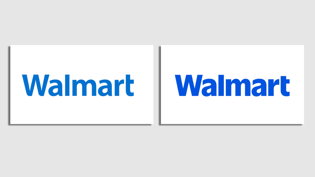
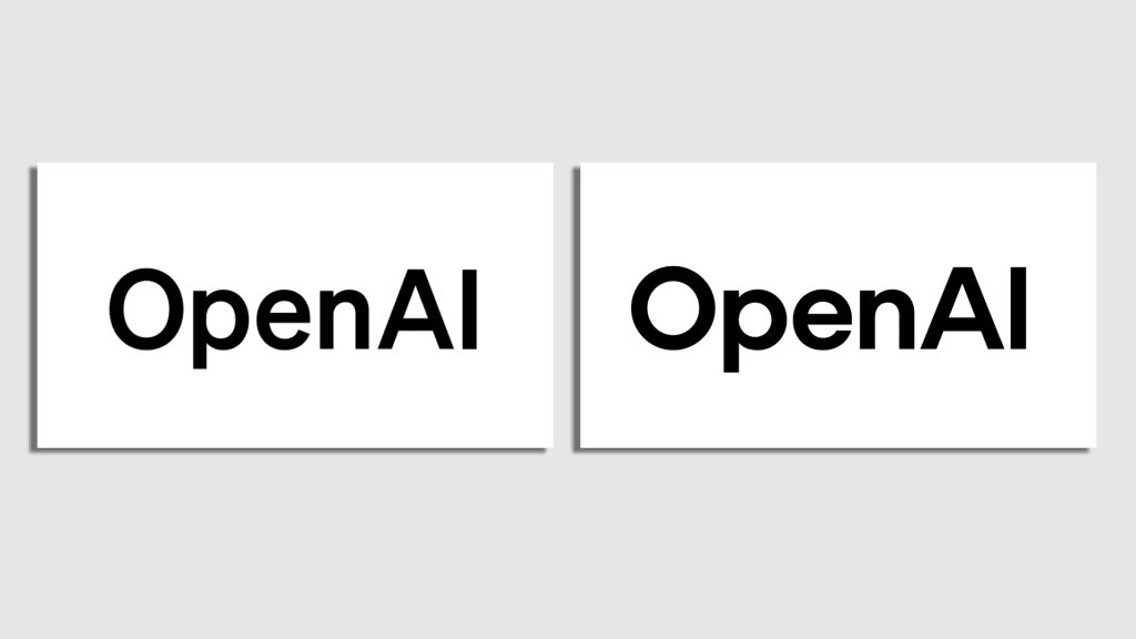
All three of these corporate behemoths’ updated wordmarks are somewhat heavier than their predecessors, while not representing radical changes. Unlike Walmart’s brutalist look of a generation ago, with its massive and intimidating all-caps, sharp-cornered letterforms projecting its retail dominance, these new marks are all clean, respectable sans-serifs with enough roundedness to signal a degree of friendliness and approachability. Perhaps this style might be dubbed Blanding Bold.
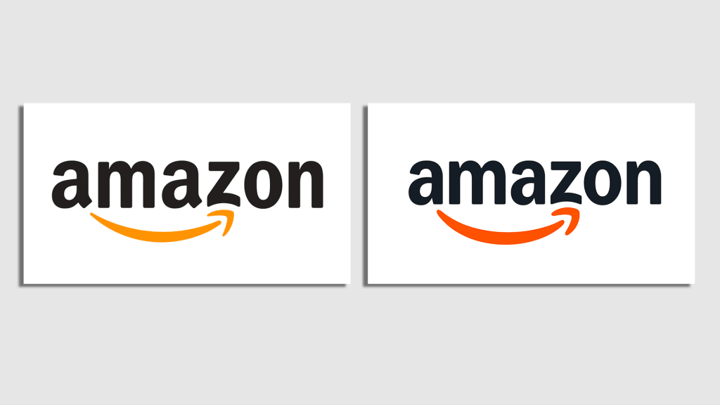
Their associated symbolic elements have undergone a similar transformation. While OpenAI’s “blossom,” Walmart’s “spark,” and Amazon’s “smile” all look basically the same as they did before, much to the consternation of some social media users who feel personally affronted that these expensive rebrands did not result in more noticeable changes, the differences are there.
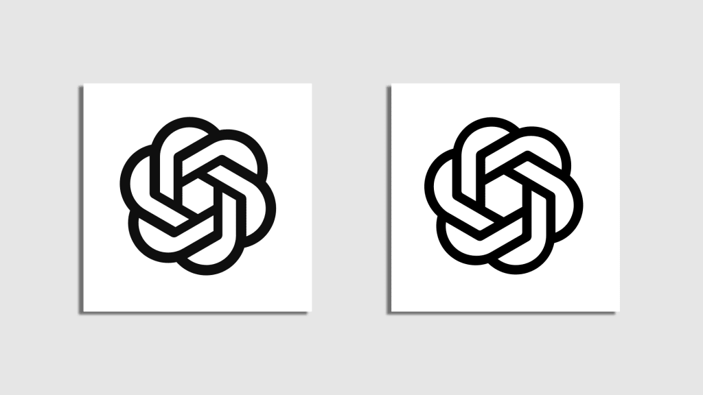
The blossom’s strokes have thickened and evened, improving its overall composition while still allowing it to evoke an unfolding flower, a foreboding whirlpool, or imagery of a more alimentary nature. The new spark met the approval of logo guru Armin Vit, who called it “softer, warmer, and more friendly while being so much better executed,” and noted that “the bolder weight of the segments gives the icon more presence and strength to stand on its own as it moves forward as the company’s primary logo.” And the Amazon logo received an injection of lip filler, resulting in what the design agency Koto calls a “deeper and more emphatic smile” (to the extent that a smile can be “emphatic”).
While the rebrands of these three giants, with their estimated combined value of $3 trillion, have attracted the most attention, this bold new trend in corporate graphics has been spotted in many other quarters over the past year or so, including PayPal, ABC, Reddit, the CW network, Workday, the Guggenheim, Herman Miller, Eventbrite, Crumbl, New York City Football Club, New York Botanical Garden, and even Fluz. Patient zero in this outbreak might be the 2019 Slack redesign, in which the wordmark was Ctrl+B’d and the logo’s hot dog shapes plumped just like Ball Park Franks.
What accounts for all this boldness? Companies have long expressed the desire to get more bang for their branding buck; “Make the logo bigger” is a common refrain among design clients (and one that designers tend to dread hearing). It would seem that making the logo bolder is the next best thing, allowing for more logo per square inch, a denser deployment of general logo essence, and a symbol that, like Amazon’s, is more emphatic overall. For what brand would not want its logo to be emphasized? And if a company’s goal is to use its logo to communicate boldness as a brand attribute, the single most obvious, literal, no-brainer way to do so is to just put it in bold.


