


![https //g.co/recover for help [1-866-719-1006]](https://newsquo.com/uploads/images/202506/image_430x256_684949454da3e.jpg)


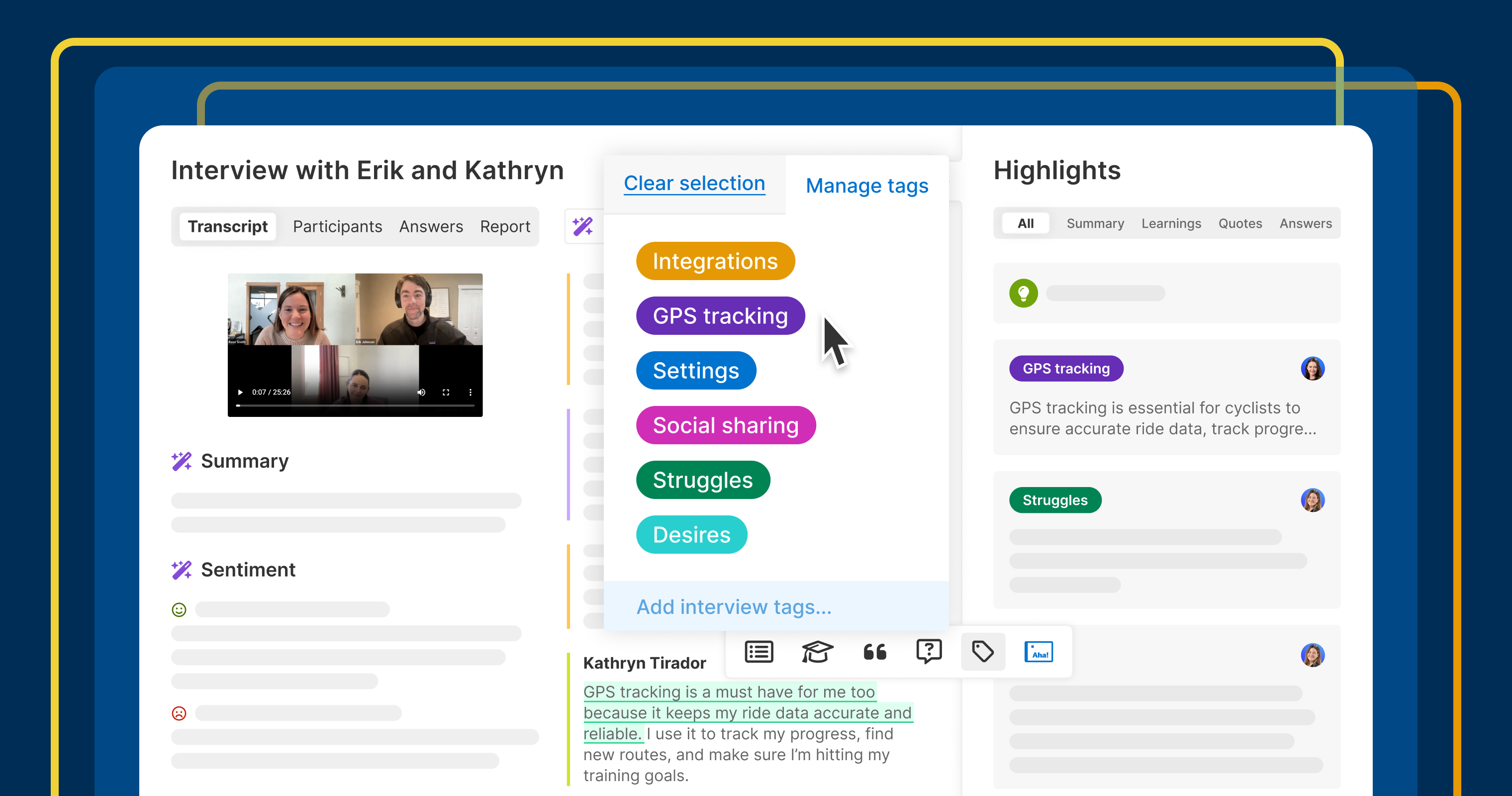


![How Smart PMs Scale Their Careers in Any Org [TPG Live Recap]](https://tpgblog.com/wp-content/uploads/2025/06/2025-06-12-thumbnail-action.png?#)


I Have a Pro Max iPhone, and iOS 26 Makes It Way Easier to Use One-Handed
iOS 26 updates the UI to make your phone way more comfortable to use when gripping it with one hand.

It's usually the flashiest software features that make headlines, but for my money, it's the functional ones that deserve the most attention. Case in point: iOS 26, where Liquid Glass is on everyone's lips, but fewer people are discussing Apple's decision to move the iPhone's search bars and other control buttons towards the bottom of the screen. With that one minor tweak, the Settings app, the Phone app, and Messages are now much more comfortable to use, and so are the call controls on FaceTime video calls. It may sound like a small change, but I love that I no longer need to stretch my fingers or hold my phone with both hands for everyday tasks on my iPhone.
This change has been a long time coming
Since my first iPhone, the iPhone 5s, I've tried to make it easier for my thumb to reach my most important apps. This used to be difficult in earlier iterations of iOS, because you couldn't customize the home screen anywhere near as much as you can today. I'd still do my best to arrange my favorite apps in an inverted L shape near the bottom-right corner of the screen, so I could easily tap them with one hand, but my ability to do so was limited. Nowadays, you can place an app icon pretty much anywhere on the home screen, and even the Control Center can be customized, but there was still room for improvement.
For example, all my careful planning always went out the window as soon as I opened any app. Many apps follow what Apple has been doing until now and place their search bars toward the top of the phone screen, where they're hard to reach. Some third-party apps do put their Create/Compose buttons near the iPhone's bottom-right corner, but Apple's own apps weren't really optimized for ergonomics, and this set a bad precedent. This wasn't such a big problem on my tiny iPhone 5s, but ever since I upgraded to a Pro Max model, it's gotten more important to me. Fortunately for me, in iOS 26, Apple has finally started to address this issue.
The revamped back gesture is great

As a right-handed person, I've never enjoyed the back gesture in iOS, which required me to move my thumb all the way to the left edge of the screen and swipe right. In iOS 26, many of Apple's apps now let you go back by swiping right from anywhere on the screen. This is a welcome change.
Search bars are easier to reach

Upon opening the Mail, Messages, Notes, Podcasts, Phone, or Settings apps in iOS 26, you should notice one welcome change. Yep, the search bar/button is now near the bottom of the display. In all of these apps, I use the search feature extensively, and it now requires a lot less effort to reach the button with my thumb. Here's hoping other developers follow suit.
The compose button is where it should be

Some apps include a button that helps you create a new file, compose an email, start a new chat, etc. In iOS 26, many of Apple's own apps have moved this button to the display's bottom-right corner, taking cues from those third-party apps I mentioned earlier. Examples include the Create Reminder button in Reminders, Compose Email button in Mail, and New Message button in Messages. Finally, Apple is catching up with the rest of the App Store.
Safari's new Compact layout is pretty ergonomic

While Safari moved its address bar to the bottom of the screen in a previous version of iOS, the version of the browser included in iOS 26 has added a new Compact layout that makes it even more ergonomic. You can now hold the address bar and swipe up to use the Copy feature, which is a far easier way to copy URLs than hitting the Share button and pressing Copy. You can also double-tap the three-dots button to bookmark pages quickly. Having said that, I do hope that Apple finds a way to keep the Share and Tabs buttons visible in future iterations of the Compact layout. Those two buttons are now buried under the three-dots button, which isn't ideal.
To switch to a layout that's more familiar, you can go to Settings > Apps > Safari in iOS 26, scroll down to Tabs, and choose Bottom.
FaceTime's new video call controls are a huge step forward

FaceTime video calls used to have call controls at the top of the screen, but that's changed in iOS 26. You'll now see those buttons lined up near the bottom-right corner of the screen. This makes it easier to mute yourself, turn off the camera, change your audio device, or just end the call.


