


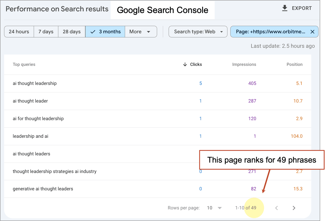
![How to Use GA4 to Track Social Media Traffic: 6 Questions, Answers and Insights [VIDEO]](https://www.orbitmedia.com/wp-content/uploads/2023/06/ab-testing.png)
![How Human Behavior Impacts Your Marketing Strategy [Video]](https://contentmarketinginstitute.com/wp-content/uploads/2025/03/human-behavior-impacts-marketing-strategy-cover-600x330.png?#)

![How to Make a Content Calendar You’ll Actually Use [Templates Included]](https://marketinginsidergroup.com/wp-content/uploads/2022/06/content-calendar-templates-2025-300x169.jpg?#)
![Building A Digital PR Strategy: 10 Essential Steps for Beginners [With Examples]](https://buzzsumo.com/wp-content/uploads/2023/09/Building-A-Digital-PR-Strategy-10-Essential-Steps-for-Beginners-With-Examples-bblog-masthead.jpg)


The Obama Foundation just reimagined the most famous font in politics
To update the Obama Foundation’s visual identity ahead of the opening of former President Barack Obama’s presidential center in Chicago next year, the designers tasked with the project had to figure out what to do with its already iconic typeface: Gotham.GQ first commissioned the geometric sans-serif typeface in 2000, but Obama’s 2008 presidential campaign made it famous (at least in design circles). The type has since become something of a default font for politics, even being co-opted, ironically, by President Donald Trump’s 2024 campaign. In effect, the aim for the Obama Foundation’s rebrand was clear: The designers had to make a completely saturated typeface feel fresh again.“That was a key challenge at the beginning of the project,” Tom Crabtree, creative director at the brand design studio Manual, tells Fast Company. “[Gotham is] simple, it’s very neutral, but for me, it didn’t really have that sort of fresh, vibrant, youthful energy.”[Image: Manual]Vibrancy and youthfulness were key to conveying the organization’s message of forward momentum, community engagement, and the power of individual action to create lasting change. Manual worked on the brand refresh alongside the digital product agency Work & Co, which updated Obama.org and other digital design projects. Sara Soskolne, who worked on the original Gotham at the type foundry Hoefler&Co. and is now a type designer at Monotype, also contributed. Their work, which is now live on the Obama Foundation website, will continue to roll out into next year with the center’s opening.[Image: Manual]Three new versions of GothamManual collaborated with Soskolne to create three bespoke versions of Gotham to keep the established Obama brand equity the typeface offers while still pushing it forward. Their first reinvention is Gotham Slab Condensed, a slab-serif display typeface designed for editorial use around communications related to civics, history, and education.[Image: Manual]The second iteration is Gotham Stencil Condensed, which uses a stencil effect meant to look more contemporary. It’s intended for use in communications around community engagement and sustainability. Gotham Inline Condensed uses a striped letterform that evokes the stripes in the Obama campaign O logo; it will be utilized for communications about athletics, music, and performance.[Image: Manual]“Gotham feels new again,” Crabtree says. “It uses the bones of a typeface, but it sort of modulates in different ways.”That modulation and versatility are crucial for the refreshed identity, which will show up online, in assets for the Obama Foundation’s programming and work, and on wayfinding signage, ticketing, and maps at the presidential center, which will serve as a community hub, museum, and library. The branding needs to communicate more traditional, presidential, and somber messages, but also be dynamic for a foundation that seeks to inspire a new generation of leaders.[Image: Manual]“Part of the museum experience is learning about the presidency and looking back,” Crabtree says. “But I think the Obama Foundation is a very forward-looking organization, and the presidential center is, I would say, as much, if not more, about looking forward as it is having a library and talking about the legacy of the presidency.”[Image: Manual]Expanded use of color That forward-looking attitude also shows up in the center’s varied color palettes, which aren’t limited to the red, white, and blue of the former president’s campaign materials. Obama Foundation programs like My Brother’s Keeper Alliance, an initiative for boys and young men of color, and Girls Opportunity Alliance, founded by former first lady Michelle Obama, have their own distinct color stories, while the annual Democracy Forum event uses gradients.[Image: Manual]Parker Sapp, a product management leader at Work & Co, says his team first prototyped the 2026 version of Obama.org as it would look after the center’s opening, then returned its focus to the current website. And while the agency has worked on nonprofit projects before, Sapp says it was a pleasant surprise to discover “how committed to innovation and good design the Obama Foundation’s team is—which is fitting when you consider President Obama was the country’s first digital president.”It’s a design-forward approach that looks nothing like what we’ve seen from a presidential library before, and it’s perfectly suited for a brand that’s synonymous with hope and change.

To update the Obama Foundation’s visual identity ahead of the opening of former President Barack Obama’s presidential center in Chicago next year, the designers tasked with the project had to figure out what to do with its already iconic typeface: Gotham.
GQ first commissioned the geometric sans-serif typeface in 2000, but Obama’s 2008 presidential campaign made it famous (at least in design circles). The type has since become something of a default font for politics, even being co-opted, ironically, by President Donald Trump’s 2024 campaign. In effect, the aim for the Obama Foundation’s rebrand was clear: The designers had to make a completely saturated typeface feel fresh again.
“That was a key challenge at the beginning of the project,” Tom Crabtree, creative director at the brand design studio Manual, tells Fast Company. “[Gotham is] simple, it’s very neutral, but for me, it didn’t really have that sort of fresh, vibrant, youthful energy.”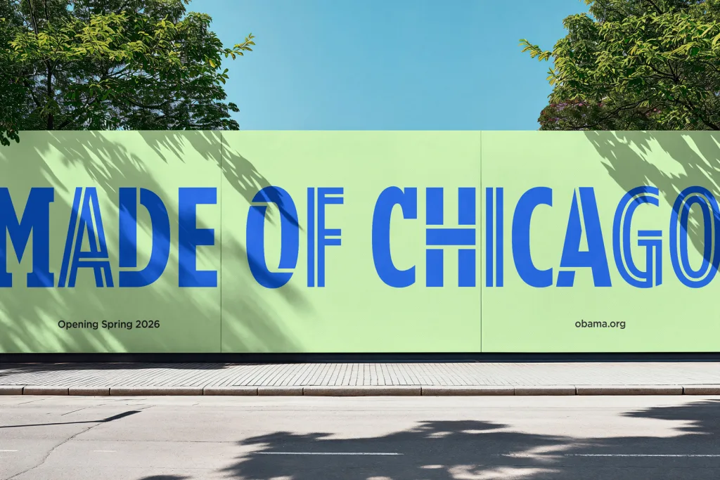
Vibrancy and youthfulness were key to conveying the organization’s message of forward momentum, community engagement, and the power of individual action to create lasting change. Manual worked on the brand refresh alongside the digital product agency Work & Co, which updated Obama.org and other digital design projects. Sara Soskolne, who worked on the original Gotham at the type foundry Hoefler&Co. and is now a type designer at Monotype, also contributed. Their work, which is now live on the Obama Foundation website, will continue to roll out into next year with the center’s opening.
Three new versions of Gotham
Manual collaborated with Soskolne to create three bespoke versions of Gotham to keep the established Obama brand equity the typeface offers while still pushing it forward. Their first reinvention is Gotham Slab Condensed, a slab-serif display typeface designed for editorial use around communications related to civics, history, and education.
The second iteration is Gotham Stencil Condensed, which uses a stencil effect meant to look more contemporary. It’s intended for use in communications around community engagement and sustainability. Gotham Inline Condensed uses a striped letterform that evokes the stripes in the Obama campaign O logo; it will be utilized for communications about athletics, music, and performance.
“Gotham feels new again,” Crabtree says. “It uses the bones of a typeface, but it sort of modulates in different ways.”
That modulation and versatility are crucial for the refreshed identity, which will show up online, in assets for the Obama Foundation’s programming and work, and on wayfinding signage, ticketing, and maps at the presidential center, which will serve as a community hub, museum, and library. The branding needs to communicate more traditional, presidential, and somber messages, but also be dynamic for a foundation that seeks to inspire a new generation of leaders.
“Part of the museum experience is learning about the presidency and looking back,” Crabtree says. “But I think the Obama Foundation is a very forward-looking organization, and the presidential center is, I would say, as much, if not more, about looking forward as it is having a library and talking about the legacy of the presidency.”
Expanded use of color
That forward-looking attitude also shows up in the center’s varied color palettes, which aren’t limited to the red, white, and blue of the former president’s campaign materials. Obama Foundation programs like My Brother’s Keeper Alliance, an initiative for boys and young men of color, and Girls Opportunity Alliance, founded by former first lady Michelle Obama, have their own distinct color stories, while the annual Democracy Forum event uses gradients.
Parker Sapp, a product management leader at Work & Co, says his team first prototyped the 2026 version of Obama.org as it would look after the center’s opening, then returned its focus to the current website. And while the agency has worked on nonprofit projects before, Sapp says it was a pleasant surprise to discover “how committed to innovation and good design the Obama Foundation’s team is—which is fitting when you consider President Obama was the country’s first digital president.”
It’s a design-forward approach that looks nothing like what we’ve seen from a presidential library before, and it’s perfectly suited for a brand that’s synonymous with hope and change.


