


This viral climate graphic just got a troubling update
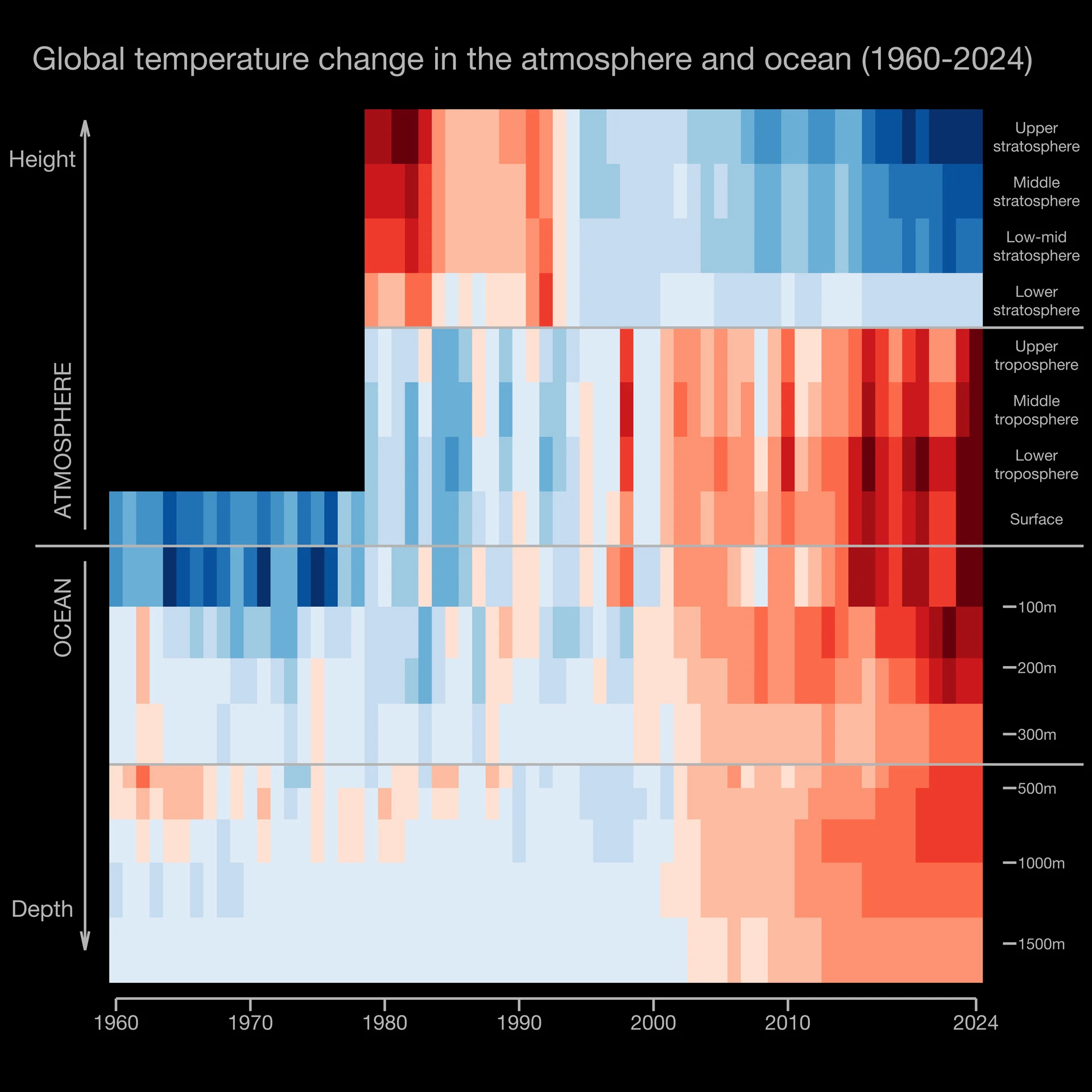
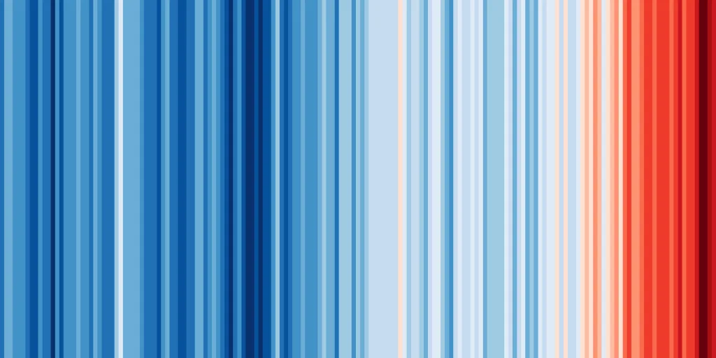
Few illustrations have electrified the climate movement more successfully—and globally—than Ed Hawkins’s climate stripes. Since the British climate scientist first published his graphic in 2018, the stripes have been displayed on Times Square billboards, printed on beer cans, splashed across fashion collections, and even woven on a scarf that was worn by the late Pope Francis. The graphic was enshrined as a design object in the Museum of Modern Art’s permanent collection in New York. The problem is, “warming stripes” have only ever shown part of the picture—namely, global average temperatures on the surface of the Earth. But climate change doesn’t stop at the surface. A newly updated version of the stripes now visualizes the impact climate change has had not just on land, but also on our oceans and the atmosphere. Some parts of the new graphic may come as a surprise. [Image: courtesy Ed Hawkins] The new “Climate Stripes” The new version was developed in collaboration with Ric Williams, a professor in the University of Liverpool’s Department of Earth, Ocean, and Ecological Sciences, alongside other scientists from the University of Liverpool and the U.K. Met Office. The data behind this expanded graphic has existed for years, but it has remained largely unknown to the public. “I got approached by two people saying, ‘What about atmosphere?’ and ‘What about ocean?’ So it was a natural thing to do,” Hawkins says. “We’ve had [these] warming estimates for a long time, but having them all in one graphic is what we’ve managed to do here.” For the ocean portion of the graph, the team drew from a mix of long-term ship-based measurements and the Argo float program, an international network of nearly 4,000 autonomous drifting sensors that measure temperature and salinity across the world’s oceans. Their findings revealed that the ocean has been warming at a rate similar to the atmosphere. That’s because a staggering 90% of the excess heat trapped by greenhouse gas emissions is absorbed by the ocean, leading to coral bleaching, mass die-offs of fish, and sea level rise (due to thermal expansion). The atmospheric stripes paint a more complex picture. While the troposphere—the lowest layer of the atmosphere—has been steadily warming, the stratosphere above it has been cooling. That contrast might seem strange, but for Hawkins, it is actually one of the clearest fingerprints of human-caused climate change. Here’s how it works: Carbon dioxide acts like a heat-trapping blanket, warming the lower atmosphere and preventing heat from reaching the upper layers. At the same time, more CO₂ in the stratosphere helps it radiate energy out into space more efficiently, which cools it further. The ozone layer is another factor at play. In the 1970s and ’80s, damage from CFCs (the chemicals once used in things like aerosol sprays and old refrigerators) reduced the amount of solar radiation absorbed in the stratosphere, especially in its lower levels, adding to the cooling. Though the ozone layer has been gradually recovering, thanks to international agreements like the Montreal Protocol, the effect is still visible in the data. For Hawkins, this vertical pattern—warming below, cooling above—is a “very clear signal” that humans are driving it. “Nothing else can explain this change,” he says. The 2019 Climate Stripes. Global average temperatures 1850-2018—each stripe is one year. Blue stripes are cooler years, red stripes are warmer years. [Image: Ed Hawkins] The impact of a visual When Hawkins first released his climate stripes, the image was downloaded more than a million times in its first week. There’s no easy way to quantify its impact beyond those downloads, but Hawkins believes it gave people—many of whom may never have engaged with climate science—a visual way to connect with the data. “My local football team in Reading used stripes on their kit for a season,” he says. The updated graphic is more complex and unlikely to go viral in quite the same way, but Hawkins believes it’s a crucial tool for more informed audiences. “That’s the key,” he says. “We need a range of ways of communicating, verbally as well as visually, to different audiences, depending on their level of expertise.” He might also need a new range of colors. When 2024 was confirmed as the hottest year on record—surpassing even the record-breaking heat of 2023—Hawkins had to update the visual to include a new, darker red stripe that appears almost black. If temperatures continue to rise over the next few years—as scientists expect they will—he may have to redesign the entire visual scale. “I have painted myself into a corner,” he says. The scientist anticipates having to rescale the entire graphic to reflect a broader temperature range. “That’s a message in itself,” he adds.
Few illustrations have electrified the climate movement more successfully—and globally—than Ed Hawkins’s climate stripes.
Since the British climate scientist first published his graphic in 2018, the stripes have been displayed on Times Square billboards, printed on beer cans, splashed across fashion collections, and even woven on a scarf that was worn by the late Pope Francis. The graphic was enshrined as a design object in the Museum of Modern Art’s permanent collection in New York.
The problem is, “warming stripes” have only ever shown part of the picture—namely, global average temperatures on the surface of the Earth. But climate change doesn’t stop at the surface. A newly updated version of the stripes now visualizes the impact climate change has had not just on land, but also on our oceans and the atmosphere. Some parts of the new graphic may come as a surprise.
The new “Climate Stripes”
The new version was developed in collaboration with Ric Williams, a professor in the University of Liverpool’s Department of Earth, Ocean, and Ecological Sciences, alongside other scientists from the University of Liverpool and the U.K. Met Office.
The data behind this expanded graphic has existed for years, but it has remained largely unknown to the public. “I got approached by two people saying, ‘What about atmosphere?’ and ‘What about ocean?’ So it was a natural thing to do,” Hawkins says. “We’ve had [these] warming estimates for a long time, but having them all in one graphic is what we’ve managed to do here.”
For the ocean portion of the graph, the team drew from a mix of long-term ship-based measurements and the Argo float program, an international network of nearly 4,000 autonomous drifting sensors that measure temperature and salinity across the world’s oceans. Their findings revealed that the ocean has been warming at a rate similar to the atmosphere. That’s because a staggering 90% of the excess heat trapped by greenhouse gas emissions is absorbed by the ocean, leading to coral bleaching, mass die-offs of fish, and sea level rise (due to thermal expansion).
The atmospheric stripes paint a more complex picture. While the troposphere—the lowest layer of the atmosphere—has been steadily warming, the stratosphere above it has been cooling. That contrast might seem strange, but for Hawkins, it is actually one of the clearest fingerprints of human-caused climate change.
Here’s how it works: Carbon dioxide acts like a heat-trapping blanket, warming the lower atmosphere and preventing heat from reaching the upper layers. At the same time, more CO₂ in the stratosphere helps it radiate energy out into space more efficiently, which cools it further.
The ozone layer is another factor at play. In the 1970s and ’80s, damage from CFCs (the chemicals once used in things like aerosol sprays and old refrigerators) reduced the amount of solar radiation absorbed in the stratosphere, especially in its lower levels, adding to the cooling. Though the ozone layer has been gradually recovering, thanks to international agreements like the Montreal Protocol, the effect is still visible in the data. For Hawkins, this vertical pattern—warming below, cooling above—is a “very clear signal” that humans are driving it. “Nothing else can explain this change,” he says.
The impact of a visual
When Hawkins first released his climate stripes, the image was downloaded more than a million times in its first week. There’s no easy way to quantify its impact beyond those downloads, but Hawkins believes it gave people—many of whom may never have engaged with climate science—a visual way to connect with the data. “My local football team in Reading used stripes on their kit for a season,” he says.
The updated graphic is more complex and unlikely to go viral in quite the same way, but Hawkins believes it’s a crucial tool for more informed audiences. “That’s the key,” he says. “We need a range of ways of communicating, verbally as well as visually, to different audiences, depending on their level of expertise.”
He might also need a new range of colors. When 2024 was confirmed as the hottest year on record—surpassing even the record-breaking heat of 2023—Hawkins had to update the visual to include a new, darker red stripe that appears almost black.
If temperatures continue to rise over the next few years—as scientists expect they will—he may have to redesign the entire visual scale. “I have painted myself into a corner,” he says.
The scientist anticipates having to rescale the entire graphic to reflect a broader temperature range. “That’s a message in itself,” he adds.