


![Are AI Chatbots Replacing Search Engines? AI vs Google [New Research]](https://www.orbitmedia.com/wp-content/uploads/2025/05/How-often-are-we-using-AI-chatbots_.webp)


Google goes maximalist with its new Material Design kit
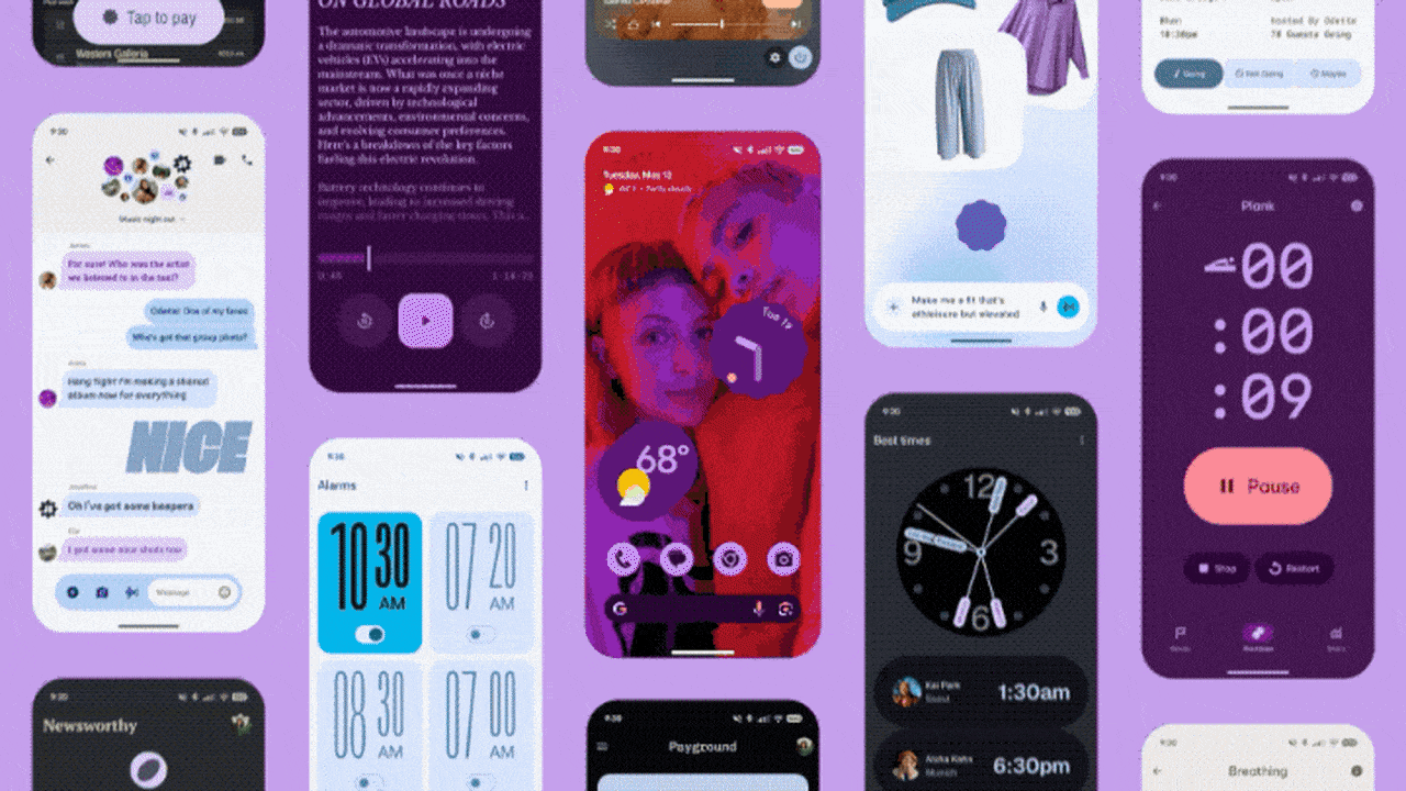
Eleven years after Google first announced its grand unifying theory of design—Material Design—it’s introducing its third major revision to the system.Called Material 3 Expressive, the company will tell you that it’s their most “researched update” ever, promising to help people find what they’re looking for on the screen faster than before. But it’s also the company’s most maximalist design system to date. Still enabling quieter minimalist designs, sure, but embracing bolder colors, more playful animations, and all around more overt approaches to interface. There’s a new roundness to almost every component, right down to the tips of Google’s new default typeface, Google Sans Flex Rounded, which replaces the hard edged terminals on letterforms with smooth tips.[Image: Google]But mostly, Google is using more of everything to accentuate contrast, like between headers and bodies. Button shapes can now be anything from giant pills to stars. Perkier animations rekindle tech’s old favorite words, “joy” and “delight,” with a bit more springiness in them across the board. And UI elements on your screen often react to others—dial a phone number, and each digit you press bounces the others out of the way like cartoony bubble tape.“It’s kind of like the next evolution,” says Vanessa Cho, VP, Google Design. “It’s design with the soul. What I mean by that is it’s [still] driven with deep purpose…but it also connects with you on the emotional level.”[Image: Google]The history of Material DesignMaterial Design was born over a decade ago, as Google Designers developed a grounding metaphor to codify its otherwise fragmented approach to design. Inspired by light and paper, Material Design was like a stretchy piece of wonder paper that could reshape to do anything, and it brought a sense of tactile physics to Search, Android, and other Google Services.In the years since, Material Design veered from its ambitious roots. It imagined eventually breaking out of screens and becoming the interface for our lives—what would be a better interface for an internet of things than literal matter that would reshape itself in front of you? Material Design was built for a path toward that smart infrastructure that seemed so inevitable in the 2010s. But a decade later, and the world didn’t play out that way. Instead, most things stayed dumb as we got sucked deeper and deeper into our phones. The stoic minimalism that Material Design v 1 celebrated got washed out by the pixel onslaughts of TikTok and other social media platforms. The emoji of 2014 seem quaint by the comparison of just about everything on Instagram, where even AI characters are attempting to be my bff.So in 2021, Material Design pivoted. It became more about personalization—allowing your phone to have a color palette and typefaces more reflective of you. And now? Material Design is trending more maximal, with an overt approach to design that’s willing to call attention to itself as a moment of celebration, rather than disappear into the background.[Image: Google]“We’re in an era of expression…thinking about TikTok and whatever you’re on,” says Mindy Brooks, VP, Product & UX, Android Platform. “So this design system allows us to, even as developers and creators of it, to express what we want to in the product.”Testing and manifestingAcross Google’s products, these new design standards play out in different ways. On Android, it means we see apps presented in a greater array of typefaces (pushing expressiveness and information hierarchy at the same time), while apps like Photos trend toward the Canva-create-a-card vibes we get on iOS today. On Wear OS, the colors from your phone can be mirrored on your wrist, and buttons now wrap all the way into the curves of the display through a lovely marriage of device and UI.[Image: Google]But what Google’s design team most wants to highlight is that Material 3 Expressive isn’t style over substance. Validated by 46 studies that tested hundreds of designs across more than 18,000 participants, they found that the expressive end of the Material Design system was preferred across all age groups, though especially Gen Z, which preferred the more maximalist screens 87% of the time.[Image: Google]The team also found that Material 3 Expressive was faster to navigate. Certain actions were spotted up to 4x faster than before. And while older adults are typically slower at finding certain buttons on the screen, the larger buttons inside Material 3 Expressive proved faster to find for everyone—while eliminating the age gap. Google claims older adults can use this design system with the same rapidity of youth. (And who woulda thunk, a big red “send” button would be easier to spot than that old little paper airplane in the corner?)As a design solution, it’s hard to argue with Google’s own validating data or the joy of bringing in more color and motion into the mix. But I’m more interested in Material 3 Expression for what it reveals about this era of design
Eleven years after Google first announced its grand unifying theory of design—Material Design—it’s introducing its third major revision to the system.
Called Material 3 Expressive, the company will tell you that it’s their most “researched update” ever, promising to help people find what they’re looking for on the screen faster than before. But it’s also the company’s most maximalist design system to date. Still enabling quieter minimalist designs, sure, but embracing bolder colors, more playful animations, and all around more overt approaches to interface. There’s a new roundness to almost every component, right down to the tips of Google’s new default typeface, Google Sans Flex Rounded, which replaces the hard edged terminals on letterforms with smooth tips.
But mostly, Google is using more of everything to accentuate contrast, like between headers and bodies. Button shapes can now be anything from giant pills to stars. Perkier animations rekindle tech’s old favorite words, “joy” and “delight,” with a bit more springiness in them across the board. And UI elements on your screen often react to others—dial a phone number, and each digit you press bounces the others out of the way like cartoony bubble tape.
“It’s kind of like the next evolution,” says Vanessa Cho, VP, Google Design. “It’s design with the soul. What I mean by that is it’s [still] driven with deep purpose…but it also connects with you on the emotional level.”
The history of Material Design
Material Design was born over a decade ago, as Google Designers developed a grounding metaphor to codify its otherwise fragmented approach to design. Inspired by light and paper, Material Design was like a stretchy piece of wonder paper that could reshape to do anything, and it brought a sense of tactile physics to Search, Android, and other Google Services.
In the years since, Material Design veered from its ambitious roots. It imagined eventually breaking out of screens and becoming the interface for our lives—what would be a better interface for an internet of things than literal matter that would reshape itself in front of you? Material Design was built for a path toward that smart infrastructure that seemed so inevitable in the 2010s.
But a decade later, and the world didn’t play out that way. Instead, most things stayed dumb as we got sucked deeper and deeper into our phones. The stoic minimalism that Material Design v 1 celebrated got washed out by the pixel onslaughts of TikTok and other social media platforms. The emoji of 2014 seem quaint by the comparison of just about everything on Instagram, where even AI characters are attempting to be my bff.
So in 2021, Material Design pivoted. It became more about personalization—allowing your phone to have a color palette and typefaces more reflective of you.
And now? Material Design is trending more maximal, with an overt approach to design that’s willing to call attention to itself as a moment of celebration, rather than disappear into the background.
“We’re in an era of expression…thinking about TikTok and whatever you’re on,” says Mindy Brooks, VP, Product & UX, Android Platform. “So this design system allows us to, even as developers and creators of it, to express what we want to in the product.”
Testing and manifesting
Across Google’s products, these new design standards play out in different ways. On Android, it means we see apps presented in a greater array of typefaces (pushing expressiveness and information hierarchy at the same time), while apps like Photos trend toward the Canva-create-a-card vibes we get on iOS today. On Wear OS, the colors from your phone can be mirrored on your wrist, and buttons now wrap all the way into the curves of the display through a lovely marriage of device and UI.
But what Google’s design team most wants to highlight is that Material 3 Expressive isn’t style over substance. Validated by 46 studies that tested hundreds of designs across more than 18,000 participants, they found that the expressive end of the Material Design system was preferred across all age groups, though especially Gen Z, which preferred the more maximalist screens 87% of the time.
The team also found that Material 3 Expressive was faster to navigate. Certain actions were spotted up to 4x faster than before. And while older adults are typically slower at finding certain buttons on the screen, the larger buttons inside Material 3 Expressive proved faster to find for everyone—while eliminating the age gap. Google claims older adults can use this design system with the same rapidity of youth. (And who woulda thunk, a big red “send” button would be easier to spot than that old little paper airplane in the corner?)
As a design solution, it’s hard to argue with Google’s own validating data or the joy of bringing in more color and motion into the mix. But I’m more interested in Material 3 Expression for what it reveals about this era of design.
For the last decade and a half, minimalism has taken over everything from blanded branding to interface (the world of interior design notwithstanding, which has been waffling on the idea for some time). But celebratory expression used to be in! Animations like Apple’s genie effect—which shrunk apps into your taskbar like a genie into the lamp—embodied playfulness before minimalism conquered tech. They were invented way back in 2004 during a more optimistic time in tech, right beside bondi blue iMacs with handles on them. This was the hope of a world that didn’t end after Y2K.
Now, screen time debates have been decimated by the For You Page and AI everything, while your Grazas and Manischewtizs of the world prioritize a bit of funk over subdued Swissness. We’re back in expressive times again.