


![Building A Digital PR Strategy: 10 Essential Steps for Beginners [With Examples]](https://buzzsumo.com/wp-content/uploads/2023/09/Building-A-Digital-PR-Strategy-10-Essential-Steps-for-Beginners-With-Examples-bblog-masthead.jpg)


![Senior Support Engineer - US West [IC3] at Sourcegraph](
https://nodesk.co/remote-companies/assets/logos/sourcegraph.f91af2c37bfa65f4a3a16b8d500367636e2a0fa3f05dcdeb13bf95cf6de09046.png
)


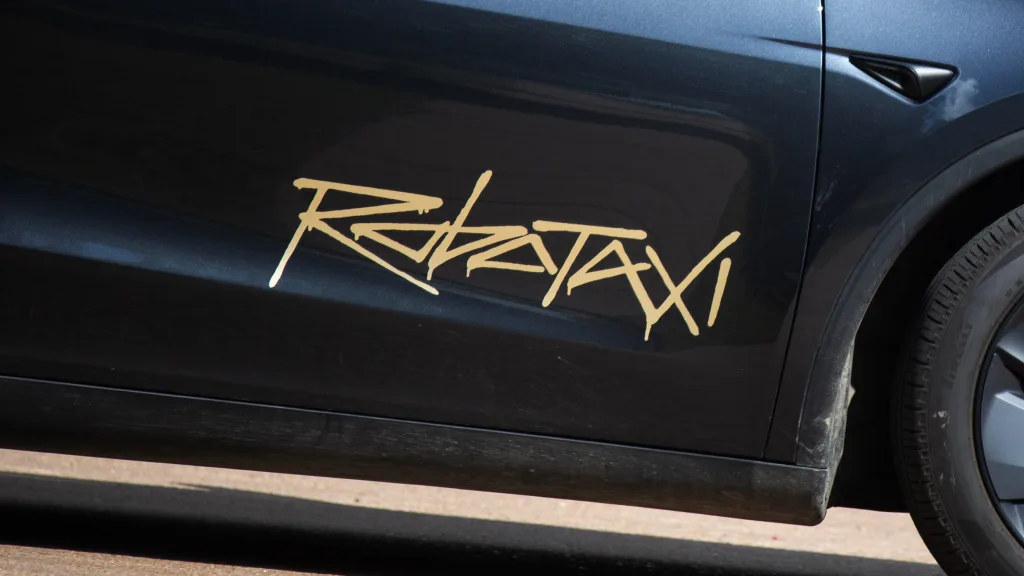
What is going on with the Tesla Robotaxi logo?
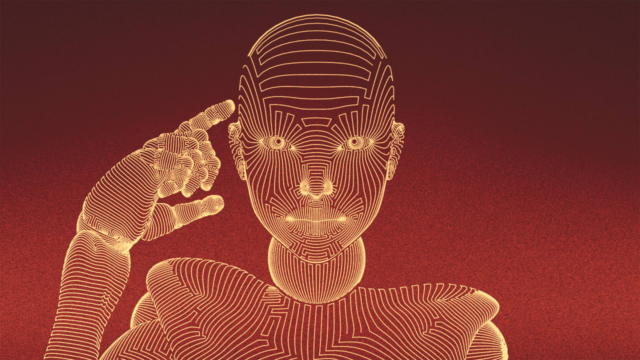
Tesla launched its Robotaxi service Monday in Austin, Texas, with a limited pilot featuring a small fleet of self-driving cars. Tesla has encountered challenges getting its Robotaxi service up and running, and now it’s facing a new hurdle of its own making: the Robotaxi logo. The self-driving taxis feature a “Robotaxi” logo written out in a graffiti style on the car’s front doors. The scrawled typeface is reminiscent of the branding for the video game Cyberpunk, and hearkens directly back to the Tesla Cybertruck logo (a puzzling choice considering how poorly the Cybertruck has been received). With its sharp edges and careening forward slant, the logo doesn’t exactly scream “safe.” And yet, that’s exactly what a new autonomous vehicle brand should be doing. AVs require a higher level of consumer trust than your average product or service, since you’re putting your life in its hands. A logo that looks spray-painted doesn’t communicate that, nor does the pilot program’s flat $4.20 ride fee. The logo “looks sloppy and casual, not reassuring,” Eben Sorkin, art director of the type foundry Darden Studio, tells Fast Company, calling it “aesthetically anachronistic and out of sync with current cultural vibes.” “Would you board a flight with an airline logo that looks like this?” he asks. [Photo: Tim Goessman/Bloomberg/Getty Images] The Robotaxi rollout represents a chance for the beleaguered electric vehicle company to change the narrative after CEO Elon Musk’s unpopular foray into government. And indeed, after the Robotaxi announcement, Tesla’s stock rose. From a branding perspective, though, the Robotaxi wordmark isn’t suggestive of a company moving away from the Cybertruck aesthetic that has now become associated with Musk’s DOGE efforts. Rather than using a visual identity that communicates safety, trust, or reliability, the logo is a sign that the company sees the graffiti-style cyberpunk aesthetic of its Cybertruck as the model for branding future products and services. “A good logo always tries to convey the brand promise,” says type designer and Hoefler & Co. founder Jonathan Hoefler. “And this one definitely foreshadows the tragic collisions ahead.”
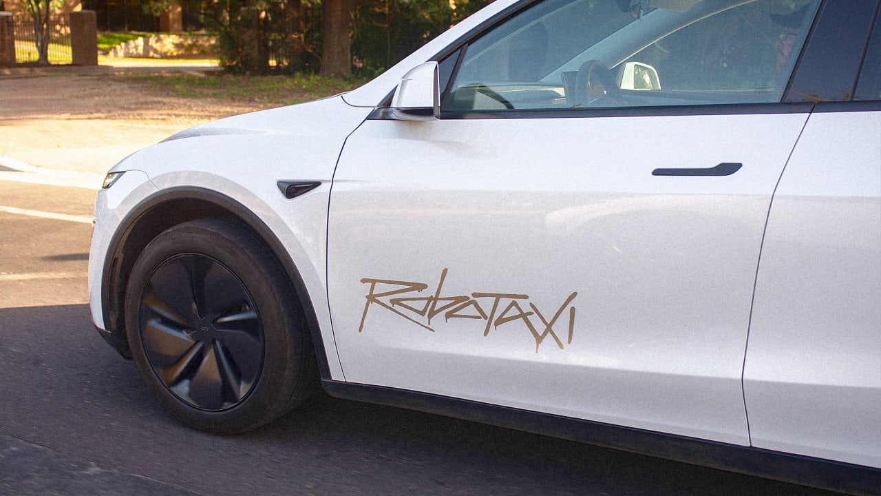
Tesla launched its Robotaxi service Monday in Austin, Texas, with a limited pilot featuring a small fleet of self-driving cars. Tesla has encountered challenges getting its Robotaxi service up and running, and now it’s facing a new hurdle of its own making: the Robotaxi logo.
The self-driving taxis feature a “Robotaxi” logo written out in a graffiti style on the car’s front doors. The scrawled typeface is reminiscent of the branding for the video game Cyberpunk, and hearkens directly back to the Tesla Cybertruck logo (a puzzling choice considering how poorly the Cybertruck has been received).
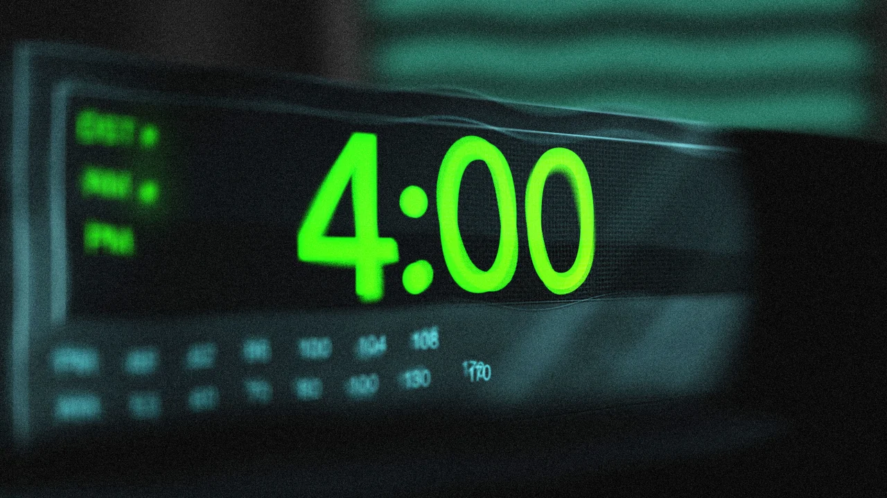
With its sharp edges and careening forward slant, the logo doesn’t exactly scream “safe.” And yet, that’s exactly what a new autonomous vehicle brand should be doing. AVs require a higher level of consumer trust than your average product or service, since you’re putting your life in its hands. A logo that looks spray-painted doesn’t communicate that, nor does the pilot program’s flat $4.20 ride fee.
The logo “looks sloppy and casual, not reassuring,” Eben Sorkin, art director of the type foundry Darden Studio, tells Fast Company, calling it “aesthetically anachronistic and out of sync with current cultural vibes.”
“Would you board a flight with an airline logo that looks like this?” he asks.
The Robotaxi rollout represents a chance for the beleaguered electric vehicle company to change the narrative after CEO Elon Musk’s unpopular foray into government. And indeed, after the Robotaxi announcement, Tesla’s stock rose.
From a branding perspective, though, the Robotaxi wordmark isn’t suggestive of a company moving away from the Cybertruck aesthetic that has now become associated with Musk’s DOGE efforts. Rather than using a visual identity that communicates safety, trust, or reliability, the logo is a sign that the company sees the graffiti-style cyberpunk aesthetic of its Cybertruck as the model for branding future products and services.
“A good logo always tries to convey the brand promise,” says type designer and Hoefler & Co. founder Jonathan Hoefler. “And this one definitely foreshadows the tragic collisions ahead.”