


![Building A Digital PR Strategy: 10 Essential Steps for Beginners [With Examples]](https://buzzsumo.com/wp-content/uploads/2023/09/Building-A-Digital-PR-Strategy-10-Essential-Steps-for-Beginners-With-Examples-bblog-masthead.jpg)


![How One Brand Solved the Marketing Attribution Puzzle [Video]](https://contentmarketinginstitute.com/wp-content/uploads/2025/03/marketing-attribution-model-600x338.png?#)


How the New Yorker’s covers redefined visual storytelling for a century
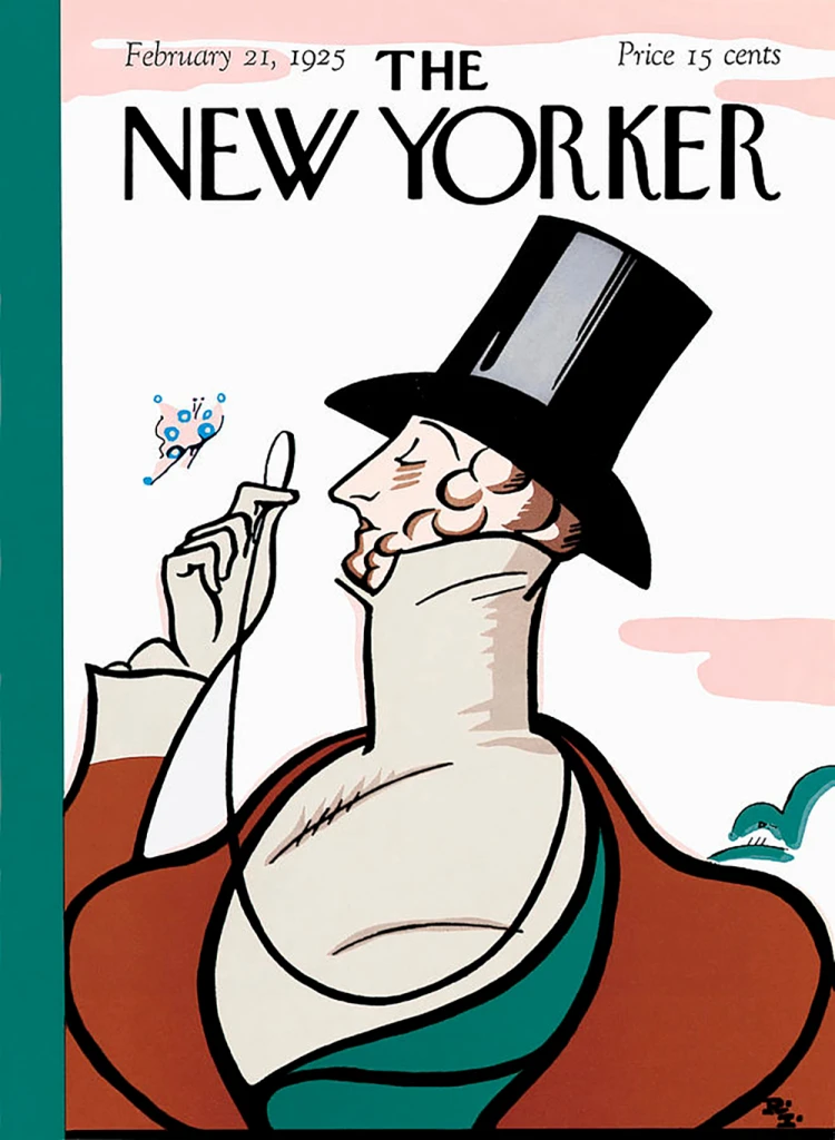
Over the last century of glorious, tragic, turbulent, and innovative human endeavour, the cover of the New Yorker magazine has used only the illustrated image to communicate talking points of American—and specifically New York City—life and culture. Beyond the masthead and issue date, no set typography has ever been allowed, maintaining a unique wordless space in magazine publishing where only an image connotes the idea. The absence of copy is arresting, the silent core of what the solely visual can communicate. Though notably, the majority of weekly sales are by subscription, not impulse buys. There are few of the New Yorker’s 1925 newsstand contemporaries left. Meanwhile, publications like Time, Newsweek, and Fortune have not resisted the dominant orthodoxy of photography with multiple cover lines to gain sales. While photography delivers celebrity and the spectacle of modern life, the New Yorker has maintained a belief in visualizing without written explanation to reach those readers who seek something more. But how can a magazine whose survival depends on sales maintain appeal with such apparently humble graphic means? The New Yorker, February 21st, 1925. [Image: Rea Irvin] The magazine’s strategy for success has been to employ a succession of brilliant art editors (just four in 100 years—somewhat unique in magazine publishing) who understand how illustration, in the right hands, can offer appeal, surprise, entertainment and imaginative freedom to invent what French poster artist Cassandre called “a visual incident.” Posters and magazine covers have a similar task: both vie to grab the attention of a public subjected to evermore intrusive image assault. From simple street hoardings and news vendors in 1925, to broadcast then digital media today, the changes over the last 100 years have been immense and profound. This audio-visual bombardment of words, images, sound and movement simply did not exist back then. This golden age of the printed poster and magazine cover appears now to belong another world—so how can preservation of these ideals be viable in a 21st century weekly magazine? Illustration and its reinvention as an agile alternative to the over-saturation of audio-visual and written media is one key. The choice of illustration as communication remains underrepresented. Other than courtroom reporting, there have been few front pages that have used a drawing, but its popular appeal evidences a relevance to complex modern lives. As a discipline, illustration is closely related to the cartoon and its sequential form, the comic strip. Many New Yorker cover artists operate across these practices, demonstrating the common ground of drawing. Illustrations are used for associative value—they conjure up an expressive or reflective mood, provide a seasoned commentary, or capture concisely a cultural moment. In the context of fake news, illustrations don’t purport to be objective—they best work through a coherent convincing visual language that offers more than words. For the majority of the New Yorker’s audience, illustration has an affectionate, unsophisticated association with successive stages of development, starting in childhood. From early picture books to comics, graphic novels, music and lifestyle, illustrated communication allows interpretation and relatability. Illustration can be successful in performing the elusive act of being inclusive and appealingly anonymous. The New Yorker recognizes that diversity in content is reliant on the real-life experience of its artists. Since the 1930s when most journalists and illustrators were male and white, the magazine has sought to make a weekly visual statement of the contemporary by prioritising images that represent the diversity of New York. There is a disposable deal in buying a magazine—it is not designed to be a keeper. Certain images of “a moment” can later become the visual signature of an age, though it may not always be apparent at the time. The early consistency of New Yorker art deco covers expressed both wonderful visual ideas and a graphic language for modernity. The skyscrapers, bridges and lights of the quintessential modern metropolis are beautifully shown in Adolph Kronengold’s cover from March 1938. The New Yorker, July 21, 2008. [Image: “The Politics of Fear,” by Barry Blitt] Barry Blitt’s 2008 “politics of fear” cover, showing Barack Obama in Muslim clothing and Michelle Obama in combats with a gun slung over her back, expressed much more than portraits in an American presidential campaign. It provocatively articulated media exaggeration and control, forces that dominate today. And then there are the images that transcend a stylistic era and which are elevated above beyond specific facts in a way that helps us see the world in a new way, like Saul Steinberg’s “view of the world from 9th Avenue” cover from 1976. The viewpoint is literally floating above the street, not so high th
Over the last century of glorious, tragic, turbulent, and innovative human endeavour, the cover of the New Yorker magazine has used only the illustrated image to communicate talking points of American—and specifically New York City—life and culture.
Beyond the masthead and issue date, no set typography has ever been allowed, maintaining a unique wordless space in magazine publishing where only an image connotes the idea. The absence of copy is arresting, the silent core of what the solely visual can communicate. Though notably, the majority of weekly sales are by subscription, not impulse buys.
There are few of the New Yorker’s 1925 newsstand contemporaries left. Meanwhile, publications like Time, Newsweek, and Fortune have not resisted the dominant orthodoxy of photography with multiple cover lines to gain sales.
While photography delivers celebrity and the spectacle of modern life, the New Yorker has maintained a belief in visualizing without written explanation to reach those readers who seek something more. But how can a magazine whose survival depends on sales maintain appeal with such apparently humble graphic means?
The magazine’s strategy for success has been to employ a succession of brilliant art editors (just four in 100 years—somewhat unique in magazine publishing) who understand how illustration, in the right hands, can offer appeal, surprise, entertainment and imaginative freedom to invent what French poster artist Cassandre called “a visual incident.”
Posters and magazine covers have a similar task: both vie to grab the attention of a public subjected to evermore intrusive image assault. From simple street hoardings and news vendors in 1925, to broadcast then digital media today, the changes over the last 100 years have been immense and profound.
This audio-visual bombardment of words, images, sound and movement simply did not exist back then. This golden age of the printed poster and magazine cover appears now to belong another world—so how can preservation of these ideals be viable in a 21st century weekly magazine?
Illustration and its reinvention as an agile alternative to the over-saturation of audio-visual and written media is one key. The choice of illustration as communication remains underrepresented. Other than courtroom reporting, there have been few front pages that have used a drawing, but its popular appeal evidences a relevance to complex modern lives.
As a discipline, illustration is closely related to the cartoon and its sequential form, the comic strip. Many New Yorker cover artists operate across these practices, demonstrating the common ground of drawing.
Illustrations are used for associative value—they conjure up an expressive or reflective mood, provide a seasoned commentary, or capture concisely a cultural moment. In the context of fake news, illustrations don’t purport to be objective—they best work through a coherent convincing visual language that offers more than words.
For the majority of the New Yorker’s audience, illustration has an affectionate, unsophisticated association with successive stages of development, starting in childhood. From early picture books to comics, graphic novels, music and lifestyle, illustrated communication allows interpretation and relatability.
Illustration can be successful in performing the elusive act of being inclusive and appealingly anonymous. The New Yorker recognizes that diversity in content is reliant on the real-life experience of its artists. Since the 1930s when most journalists and illustrators were male and white, the magazine has sought to make a weekly visual statement of the contemporary by prioritising images that represent the diversity of New York.
There is a disposable deal in buying a magazine—it is not designed to be a keeper. Certain images of “a moment” can later become the visual signature of an age, though it may not always be apparent at the time.
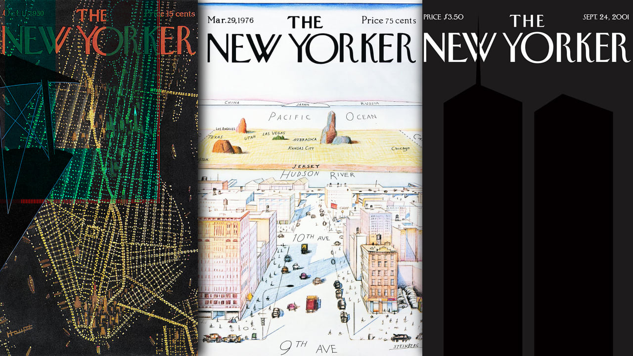
The early consistency of New Yorker art deco covers expressed both wonderful visual ideas and a graphic language for modernity. The skyscrapers, bridges and lights of the quintessential modern metropolis are beautifully shown in Adolph Kronengold’s cover from March 1938.
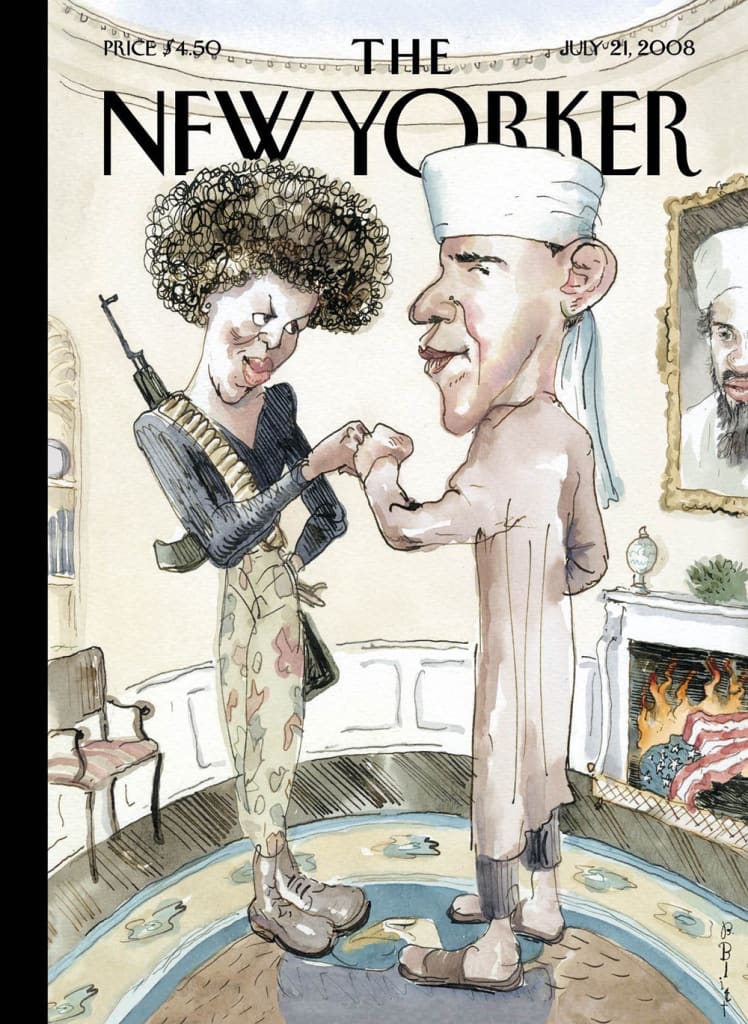
Barry Blitt’s 2008 “politics of fear” cover, showing Barack Obama in Muslim clothing and Michelle Obama in combats with a gun slung over her back, expressed much more than portraits in an American presidential campaign. It provocatively articulated media exaggeration and control, forces that dominate today.
And then there are the images that transcend a stylistic era and which are elevated above beyond specific facts in a way that helps us see the world in a new way, like Saul Steinberg’s “view of the world from 9th Avenue” cover from 1976.
The viewpoint is literally floating above the street, not so high that local details are unrecognisable, yet just beyond the Hudson are diminishing deserts and prairies and over the Pacific ocean you can see Japan.
A wonderful satire on the attitude of global centrality and specifically a New Yorker’s idea of their own importance, the image has been copied and referenced ever since its publication.
The completely black cover by Art Spiegelman and New Yorker art director Françoise Mouly for September 24 2001 achieved the impossible task of visualising the feeling of loss following the world trade centre attacks. Mouly has been the art director since 1993 and possesses a supreme visual intelligence that has driven the success of the pictorial cover for more than three decades.
She maintains that artists are able to say new things about the same themes year after year—something AI cannot do as it refers only to the past. The present, however, is elusive and the province of the artist gathering energy like a lightning conductor. Plus, crucially, AI doesn’t doodle.
New Yorker artists are people who can present a dilemma, an issue, a moment or a spectacle visually, not abstracted, but through emotional empathy. The covers are non-linear but require “reading”. The multiple layers of meaning are often open to interpretion.
The beauty of the New Yorker cover lies in not equating it with a written description, but rather in prompting an emotional response to what it is to be alive in that moment, whether good times or bad. That’s a pretty wonderful objective and guiding principle for a weekly publication.
Geoff Grandfield is an associate professor at the Illustration Animation Department at Kingston University.
This article is republished from The Conversation under a Creative Commons license. Read the original article.


