


![Are AI Chatbots Replacing Search Engines? AI vs Google [New Research]](https://www.orbitmedia.com/wp-content/uploads/2025/05/How-often-are-we-using-AI-chatbots_.webp)


Protect your protein shakes. The Brawny Man is hunkier than ever
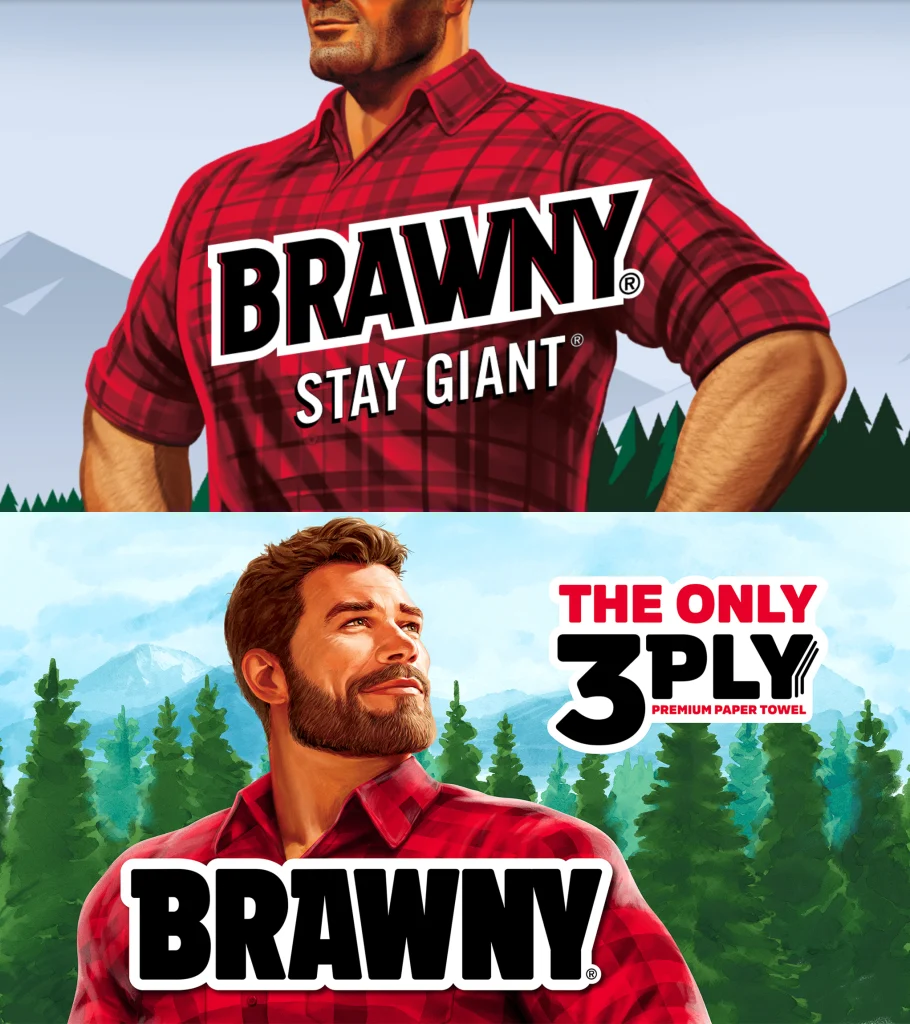
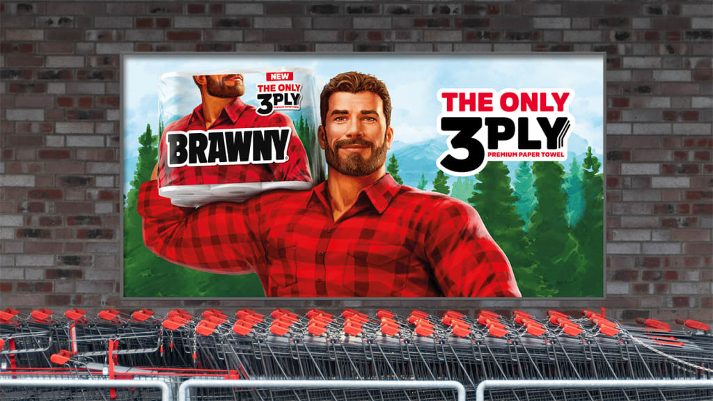
Brawny just went big on bulk. The Georgia-Pacific paper towel brand introduced a new logo set in a thicker font and breathed new life into its lumberjack mascot, the Brawny Man—all as part of a shift to stand out on store shelves and launch a new product, three-ply paper towels. “We weren’t just evolving a visual identity,” Amanda Earley, Georgia-Pacific’s brand director for Brawny, tells Fast Company. “We were launching a new product, shifting our full lineup, and repositioning the brand in culture, all while protecting what made Brawny special in the first place.” Bringing all this to market at the same time was a challenge, Earley says, but necessary to achieve the company’s overall goals: to grow household penetration, drive category growth, and convert the brand’s entire portfolio from two-ply to three. From top: The previous iteration, and the new one [Images: Georgia-Pacific] A bolder Brawny logo The logo is one part of that. “We modernized the logo to make it bolder, more confident, and unmistakably Brawny,” Earley says. The typographic beef up was also a strategic decision to “signal product superiority at shelf, reinforce brand strength, and help us stand apart in a space that often feels like a sea of sameness,” she says. Companies like Amazon, OpenAI, and Walmart have all recently made their logos bigger and bolder, but for Brawny, doing so was an imperative because of its brand promise. A paper towel brand that calls itself the strongest can’t be set in a skinny font, especially after announcing plans to increase the ply of its products by 50%. So the company made a few changes to indicate its new weight class. Its logo uses flat, bold, black-and-white letterforms, removing the red shadowing of the previous version. It’s also now set on a firm horizontal instead of a slant. The logo type is sans serif, except for the letters B and A, which have serifs that extend like eaves on a rest stop or ranger station icon. A bulked-up Brawny Man Introduced in the 1970s, the Brawny Man has undergone multiple makeovers over the years and worn his facial hair in various ways—the brand even had Brawny women as part of a 2016 campaign. In this newest iteration, the Brawny Man appears on packaging in the form of an illustration of a handsome, hunky outdoorsy type suitable for casting on The Bachelorette wearing his signature red-and-black plaid shirt. He appears oversize in new commercials, like Brawny’s own Paul Bunyan—and he’s eager to help clean up messes, whether they happen to be in the aftermath of a 40th birthday party or at a treehouse sleepover full of superstitious tween girls. [Image: Georgia-Pacific] Too often brand mascots “live frozen in time,” says Jaime Robinson, cofounder and chief creative officer at Joan Creative, which helped develop packaging and worked on the Brawny Man’s refresh. “When you have such legendary brand IP like the Brawny Man, you want to approach it thoughtfully but bravely,” Robinson says. It was all about striking the right balance between familiarity and modernity, according to Holly Karlsson, creative director at Bulletproof, the agency that worked on Brawny’s visual identity and packaging design. And by “retaining his rugged dependability while evolving his personality to feel more authentic, warm, and human,” she says, Bulletproof hoped to do just that. The new Brawny Man is a gentle giant with a bold logo to match.
Brawny just went big on bulk. The Georgia-Pacific paper towel brand introduced a new logo set in a thicker font and breathed new life into its lumberjack mascot, the Brawny Man—all as part of a shift to stand out on store shelves and launch a new product, three-ply paper towels.
“We weren’t just evolving a visual identity,” Amanda Earley, Georgia-Pacific’s brand director for Brawny, tells Fast Company. “We were launching a new product, shifting our full lineup, and repositioning the brand in culture, all while protecting what made Brawny special in the first place.”
Bringing all this to market at the same time was a challenge, Earley says, but necessary to achieve the company’s overall goals: to grow household penetration, drive category growth, and convert the brand’s entire portfolio from two-ply to three.
A bolder Brawny logo
The logo is one part of that. “We modernized the logo to make it bolder, more confident, and unmistakably Brawny,” Earley says. The typographic beef up was also a strategic decision to “signal product superiority at shelf, reinforce brand strength, and help us stand apart in a space that often feels like a sea of sameness,” she says.
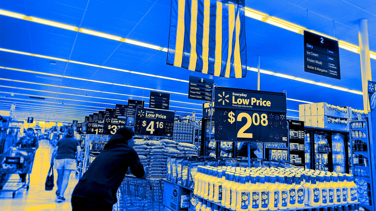
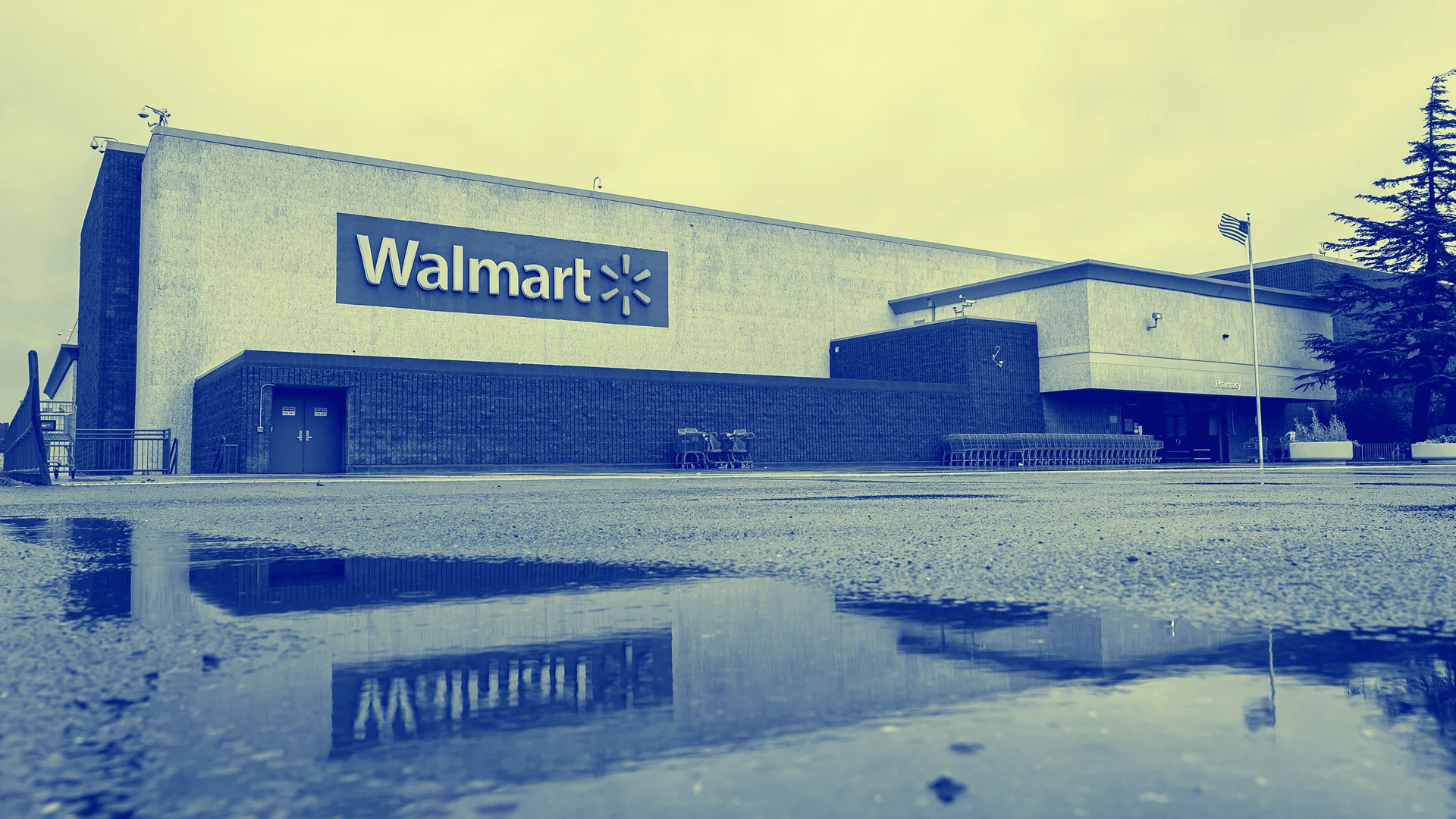
Companies like Amazon, OpenAI, and Walmart have all recently made their logos bigger and bolder, but for Brawny, doing so was an imperative because of its brand promise. A paper towel brand that calls itself the strongest can’t be set in a skinny font, especially after announcing plans to increase the ply of its products by 50%.
So the company made a few changes to indicate its new weight class. Its logo uses flat, bold, black-and-white letterforms, removing the red shadowing of the previous version. It’s also now set on a firm horizontal instead of a slant. The logo type is sans serif, except for the letters B and A, which have serifs that extend like eaves on a rest stop or ranger station icon.
A bulked-up Brawny Man
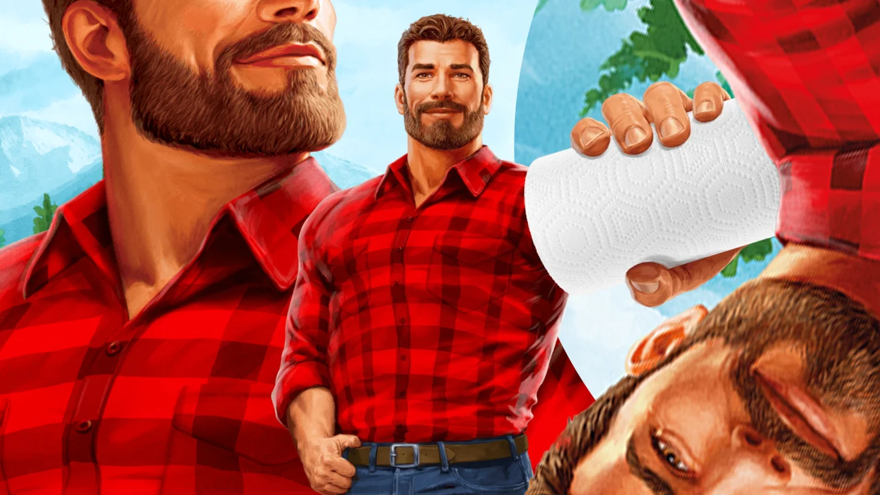
Introduced in the 1970s, the Brawny Man has undergone multiple makeovers over the years and worn his facial hair in various ways—the brand even had Brawny women as part of a 2016 campaign.
In this newest iteration, the Brawny Man appears on packaging in the form of an illustration of a handsome, hunky outdoorsy type suitable for casting on The Bachelorette wearing his signature red-and-black plaid shirt. He appears oversize in new commercials, like Brawny’s own Paul Bunyan—and he’s eager to help clean up messes, whether they happen to be in the aftermath of a 40th birthday party or at a treehouse sleepover full of superstitious tween girls.
Too often brand mascots “live frozen in time,” says Jaime Robinson, cofounder and chief creative officer at Joan Creative, which helped develop packaging and worked on the Brawny Man’s refresh. “When you have such legendary brand IP like the Brawny Man, you want to approach it thoughtfully but bravely,” Robinson says.
It was all about striking the right balance between familiarity and modernity, according to Holly Karlsson, creative director at Bulletproof, the agency that worked on Brawny’s visual identity and packaging design. And by “retaining his rugged dependability while evolving his personality to feel more authentic, warm, and human,” she says, Bulletproof hoped to do just that. The new Brawny Man is a gentle giant with a bold logo to match.