


![Building A Digital PR Strategy: 10 Essential Steps for Beginners [With Examples]](https://buzzsumo.com/wp-content/uploads/2023/09/Building-A-Digital-PR-Strategy-10-Essential-Steps-for-Beginners-With-Examples-bblog-masthead.jpg)


![How to Use GA4 to Track Social Media Traffic: 6 Questions, Answers and Insights [VIDEO]](https://www.orbitmedia.com/wp-content/uploads/2023/06/ab-testing.png)


Exclusive: Lipton’s new brand wants to be everyone’s cup of tea
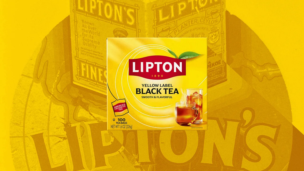
Hellmann’s. Axe. Ben & Jerry’s. Dove. Nutrafol. Pepsodent. Vaseline. When a brand exists within a CPG behemoth like Unilever, it can struggle to get dedicated design attention. So often, it doesn’t—and as a result, its brand can get a bit dusty on the shelf.That’s what happened to Lipton with an identity from 2014 that hewed closer to the 1999 Burger King logo than a modern leader of the tea industry. But now, with a new owner, Lipton is launching a fresh look as it celebrates 135 years in business and expands its product line.The big business of teaLipton is the titan of tea. Its products (which include Tazo, Pukka, PG Tips, and more) are sold in more than 100 countries and make up the largest tea business in the world. Moreover, tea is big business: Fueled in part by the focus on health in the beverage category, tea is projected to grow by more than 75% to $122.59 billion in 2033. CVC Capital Partners bought the Lipton family of brands in 2022 for $5.07 billion.[Photo: Lipton]Yet in spite of those that promise, the company has been facing what S&P Global dubbed “weaker-than-anticipated performance” last fall. And, well, that’s a design opportunity. Following the acquisition, Lipton started taking stock of its core identity, and is now rolling out its new branding, with new plans and products to boot.“If you look at what Lipton did from an innovation standpoint for the five years prior to 2023, it probably wasn’t very much,” says Racquel Harris Mason, president of Lipton Teas and Infusions North America. “And what you’ll see in America [now] is Lipton launching over 15 new flavors, new SKUs, in the next six months. So it’s really a wonderful renovation of this historical brand.”[Photo: Lipton]Sir Lipton’s legacyWhen he founded his eponymous tea brand in 1890, Thomas Lipton was on a mission to democratize a drink that was then traditionally associated with the upper classes. And as those numbers above attest, he indeed succeeded, and brought low-cost tea to the masses by setting up alternative distribution channels to circumvent the established trade.Of course, being a global tea behemoth in 2025 presents its own design problems, with rituals and aesthetic preferences varying by culture and country. Lipton Global Chief Marketing Officer Moritz von der Linden says the company’s numerous markets previously operated in a relatively decentralized environment with a fair amount of autonomy. As a result, the packs had become crowded with added elements, Lipton’s trademark yellow branding was waning in some territories as other colors were being brought in—and ultimately the product was becoming difficult to spot on shelves.“That’s where we said, we need to do something,” von der Linden notes. “We need to make sure that we bring this back to the brilliant basics [and] play our distinctive assets to their strengths again, making sure that everybody can recognize [Lipton] when they walk into a store from 50 meters away.”So von der Linden and his colleagues set out to establish Lipton’s first uniform global identity, partnering with the Paris-based agency Team Creatif. The team first looked to the past—in particular, Thomas Lipton’s original tin boxes.[Photo: Lipton]von der Linden says their bold lettering inspired the typography of the new logo, which returns to an all-caps treatment and is intended to play off of the pride the team feels around the brand and its status in the category. As an homage to the brand’s legacy, the team added the founding year of 1890 to its signature “cartouche” label, a move von der Linden says hadn’t been done in decades.“If you think about a lot of brands that are appealing to Gen Z . . . these heritage brands really do mean something,” Harris Mason says. “My children are 26, 24 and 21, and they were like, Oh, my god, that’s so cool. In a weird way, that heritage does give us a modern cool factor because of the deep authenticity of the brand.”[Photo: Lipton]To give the tea a bit more of a premium feel, the team tweaked the Lipton yellow to a slightly darker shade. They also added a leaf to nod at the health aspects of drinking tea. “[We’re] bringing nature into the package, and reminding people in this era of everything being artificial that tea has been around for 3,000 years,” says Harris Mason. “It’s crushed leaves in a bag.”That little leaf differentiates the brand away from ready-to-drink beverages. It’s a small element, but “in its brutal simplicity, a tea leaf makes a big difference,” says von der Linden.Finally, the team modernized the logo on the whole by paring down the 3D nature of the cartouche, greatly scaling back the “sun” element, and selecting Arpona as a primary typeface that echoes the letterforms of the refreshed logo.[Image: Lipton]A new LiptonThe new brand is currently making its way to shelves, and should be comprehensive in all markets by the end of the year. Currently, Unilever and Pepsi still operate a separate Lipton bottled drink venture, but Harris Mason s
Hellmann’s. Axe. Ben & Jerry’s. Dove. Nutrafol. Pepsodent. Vaseline. When a brand exists within a CPG behemoth like Unilever, it can struggle to get dedicated design attention. So often, it doesn’t—and as a result, its brand can get a bit dusty on the shelf.
That’s what happened to Lipton with an identity from 2014 that hewed closer to the 1999 Burger King logo than a modern leader of the tea industry. But now, with a new owner, Lipton is launching a fresh look as it celebrates 135 years in business and expands its product line.
The big business of tea
Lipton is the titan of tea. Its products (which include Tazo, Pukka, PG Tips, and more) are sold in more than 100 countries and make up the largest tea business in the world. Moreover, tea is big business: Fueled in part by the focus on health in the beverage category, tea is projected to grow by more than 75% to $122.59 billion in 2033. CVC Capital Partners bought the Lipton family of brands in 2022 for $5.07 billion.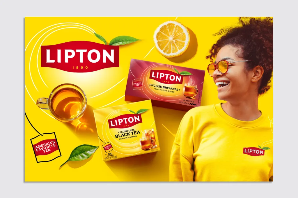
Yet in spite of those that promise, the company has been facing what S&P Global dubbed “weaker-than-anticipated performance” last fall. And, well, that’s a design opportunity. Following the acquisition, Lipton started taking stock of its core identity, and is now rolling out its new branding, with new plans and products to boot.
“If you look at what Lipton did from an innovation standpoint for the five years prior to 2023, it probably wasn’t very much,” says Racquel Harris Mason, president of Lipton Teas and Infusions North America. “And what you’ll see in America [now] is Lipton launching over 15 new flavors, new SKUs, in the next six months. So it’s really a wonderful renovation of this historical brand.”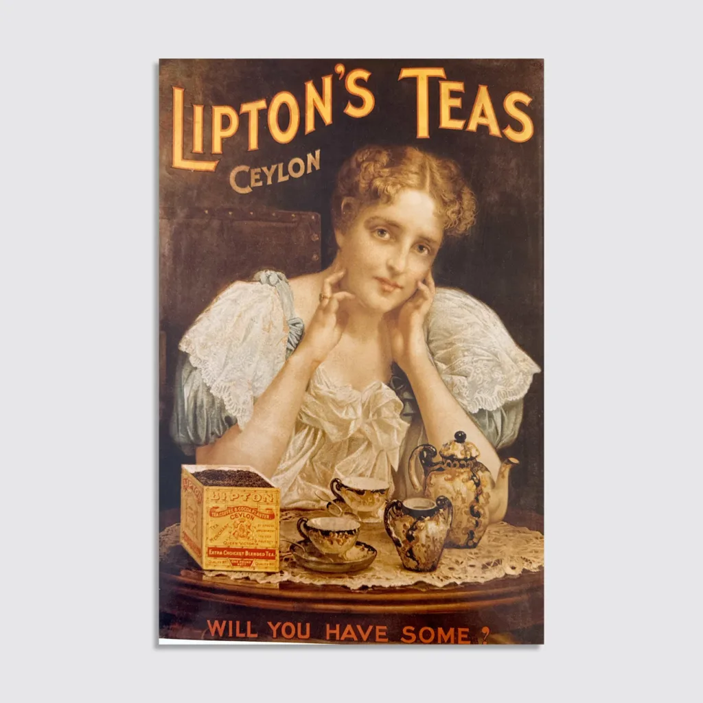
Sir Lipton’s legacy
When he founded his eponymous tea brand in 1890, Thomas Lipton was on a mission to democratize a drink that was then traditionally associated with the upper classes. And as those numbers above attest, he indeed succeeded, and brought low-cost tea to the masses by setting up alternative distribution channels to circumvent the established trade.
Of course, being a global tea behemoth in 2025 presents its own design problems, with rituals and aesthetic preferences varying by culture and country. Lipton Global Chief Marketing Officer Moritz von der Linden says the company’s numerous markets previously operated in a relatively decentralized environment with a fair amount of autonomy. As a result, the packs had become crowded with added elements, Lipton’s trademark yellow branding was waning in some territories as other colors were being brought in—and ultimately the product was becoming difficult to spot on shelves.
“That’s where we said, we need to do something,” von der Linden notes. “We need to make sure that we bring this back to the brilliant basics [and] play our distinctive assets to their strengths again, making sure that everybody can recognize [Lipton] when they walk into a store from 50 meters away.”
So von der Linden and his colleagues set out to establish Lipton’s first uniform global identity, partnering with the Paris-based agency Team Creatif. The team first looked to the past—in particular, Thomas Lipton’s original tin boxes.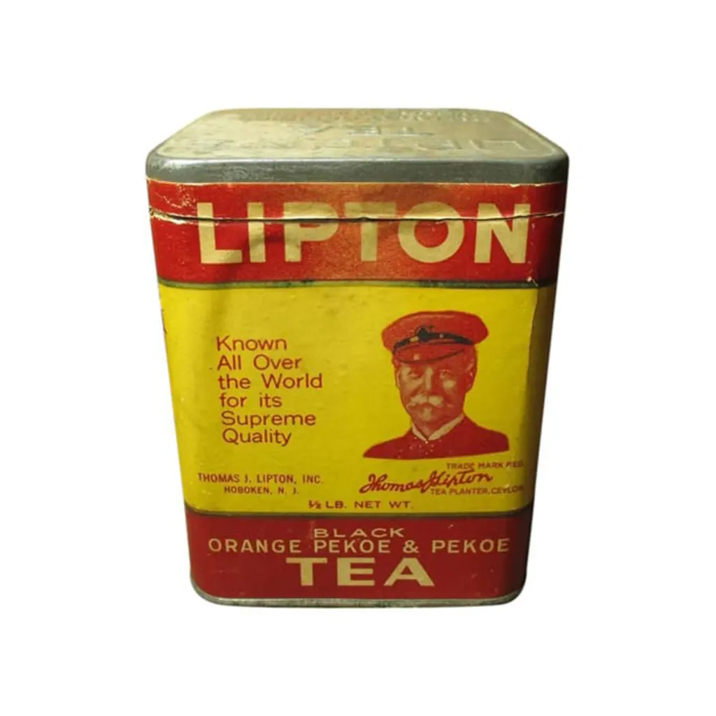
von der Linden says their bold lettering inspired the typography of the new logo, which returns to an all-caps treatment and is intended to play off of the pride the team feels around the brand and its status in the category. As an homage to the brand’s legacy, the team added the founding year of 1890 to its signature “cartouche” label, a move von der Linden says hadn’t been done in decades.
“If you think about a lot of brands that are appealing to Gen Z . . . these heritage brands really do mean something,” Harris Mason says. “My children are 26, 24 and 21, and they were like, Oh, my god, that’s so cool. In a weird way, that heritage does give us a modern cool factor because of the deep authenticity of the brand.”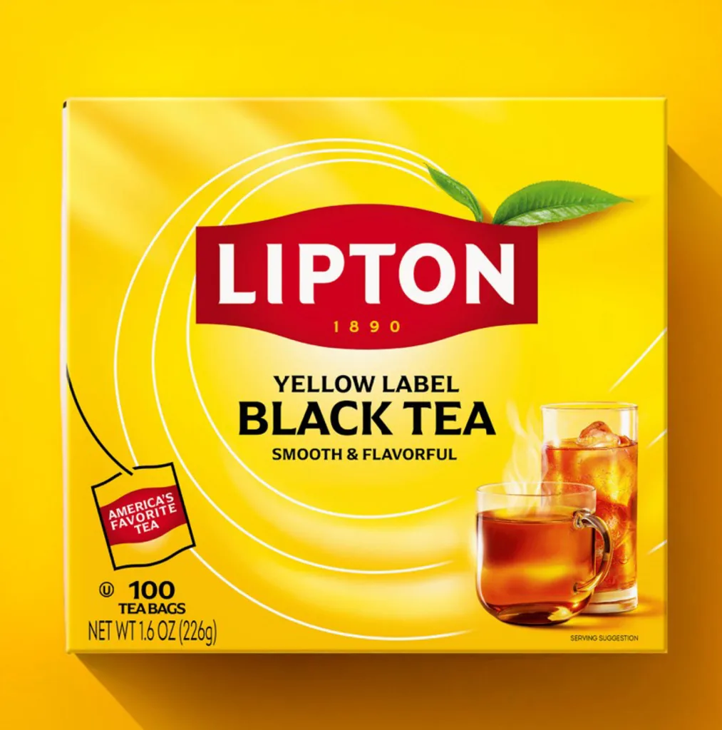
To give the tea a bit more of a premium feel, the team tweaked the Lipton yellow to a slightly darker shade. They also added a leaf to nod at the health aspects of drinking tea. “[We’re] bringing nature into the package, and reminding people in this era of everything being artificial that tea has been around for 3,000 years,” says Harris Mason. “It’s crushed leaves in a bag.”
That little leaf differentiates the brand away from ready-to-drink beverages. It’s a small element, but “in its brutal simplicity, a tea leaf makes a big difference,” says von der Linden.
Finally, the team modernized the logo on the whole by paring down the 3D nature of the cartouche, greatly scaling back the “sun” element, and selecting Arpona as a primary typeface that echoes the letterforms of the refreshed logo.
A new Lipton
The new brand is currently making its way to shelves, and should be comprehensive in all markets by the end of the year. Currently, Unilever and Pepsi still operate a separate Lipton bottled drink venture, but Harris Mason says she regularly meets with the team there, and they love the new work. (“I would be very surprised if this does not get adopted,” von der Linden notes.)
Ultimately, their hope is that the design work will bring more people to the brand—and that innovation and new products will keep them there. To that end, they have launched a Lipton black tea speciality category, and the first two entries are an English Breakfast and an Earl Grey that tastes like the usual cardamom classic, but with a hint of citrus. Those products have officially rolled out with the new branding. On deck for the summer is a fruit and herbal range, as well as zero-sugar iced tea powders.
Do they have any fears that the new products may cannibalize their other brands, such as Tazo? Harris Mason says the company is very intentional about Lipton’s positioning—a tea that’s more affordable and approachable.
“[It’s about] making sure that we’ve kept the core but we’ve also innovated to have a broader portfolio of more relevant offerings, so that we can really have a tea for everyone and live up to what Sir Thomas Lipton wanted to do in democratizing tea,” Harris Mason says. “There’s so much new innovation coming. It’s not just a new design; it’s a new Lipton.”


