


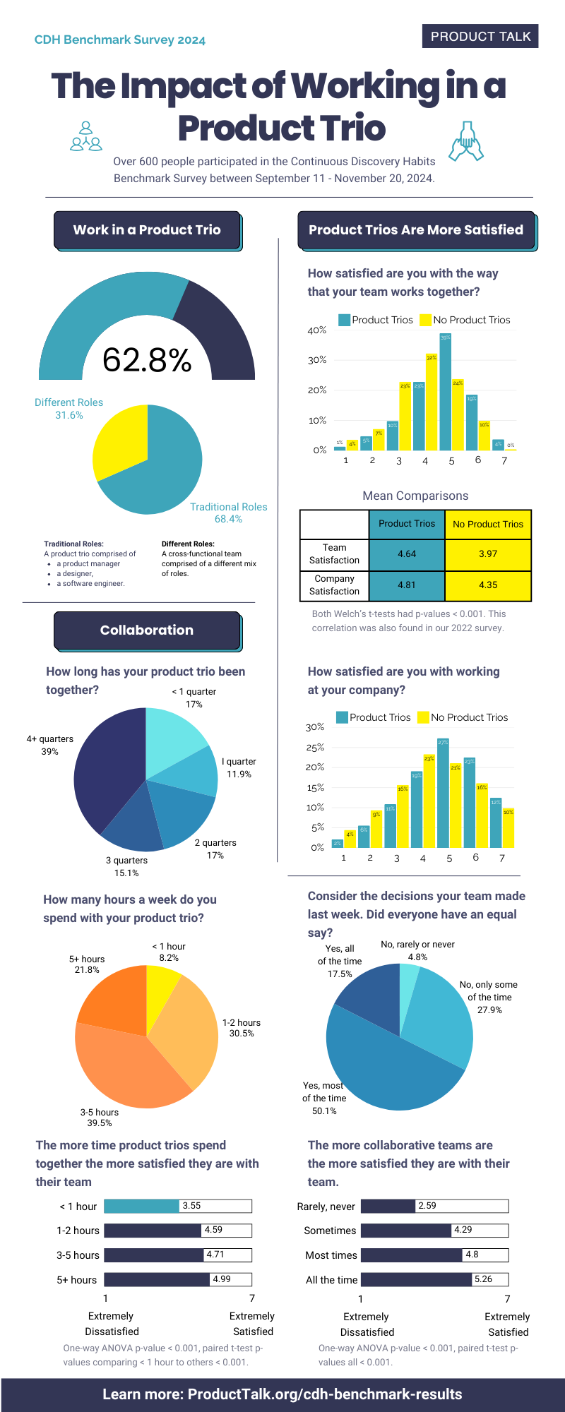


![How One Brand Solved the Marketing Attribution Puzzle [Video]](https://contentmarketinginstitute.com/wp-content/uploads/2025/03/marketing-attribution-model-600x338.png?#)
![Building A Digital PR Strategy: 10 Essential Steps for Beginners [With Examples]](https://buzzsumo.com/wp-content/uploads/2023/09/Building-A-Digital-PR-Strategy-10-Essential-Steps-for-Beginners-With-Examples-bblog-masthead.jpg)


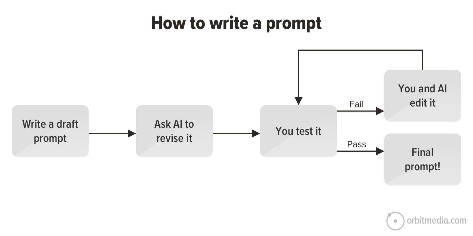
![How to Use GA4 to Track Social Media Traffic: 6 Questions, Answers and Insights [VIDEO]](https://www.orbitmedia.com/wp-content/uploads/2023/06/ab-testing.png)


![[HYBRID] ?? Graphic Designer](https://a5.behance.net/cbf14bc4db9a71317196ed0ed346987c1adde3bb/img/site/generic-share.png)


Why California Pizza Kitchen just faked an insane rebrand
Beverly Hills’ hottest club is California Pizza Kitchen. At least, that’s what someone unfamiliar with the brand might have taken away from its new “rebrand,” which debuted on Monday. On its website, California Pizza Kitchen replaced its friendly yellow logo and wordmark with a silver chrome logo and the shortened name “CPK.” [Photo: courtesy California Pizza Kitchen] Meanwhile, on socials, the brand posted several videos of its “new identity” that looked more fit for promoting a rave than a family friendly pizza restaurant. Shots of flashing lights, serious models, and slogans like “DEVOUR THE DOUBTERS” and “Fresh. To. Death” were cut with clips of harshly-lit pizzas and interspersed with the brand’s new all-caps wordmark. At first glance, one might have assumed these were assets for a new Liquid Death campaign or MSCHF launch. Many commenters on CPK’s socials were quick to question what was going on with the brand, including the official Little Caeser’s account, which commented, “Bestie what’s happening” on a particularly odd video. But, as it turns out, the whole edgelord rebrand was just a temporary marketing play to promote California Pizza Kitchen’s 40th anniversary. The restaurant just revealed the hoax through a partnership with actress Busy Phillips and restored its platforms to its original branding. The campaign shows that, amidst an influx of purposefully shocking brand moves like Jaguar’s totally unrecognizable rebrand or Duolingo’s decision to briefly kill off its mascot, we’ve reached a new stage of the trend cycle: full brand-on-brand parody. CPK’s midlife crisis Dawn Keller joined California Pizza Kitchen’s as its CMO about a year ago. Since then, she says, she’s learned that sentiment around the brand is overwhelmingly positive, given that many customers associate it with years of childhood dinners. The issue, though, is that many fans “just don’t think about CPK that often,” Keller says. Part of the problem is that the restaurant hasn’t made much of an investment in its marketing efforts to keep CPK top of mind. On socials, it has a staid strategy of essentially reposting traditional ad materials—an approach that’s less than ideal in a social media landscape that rewards brands who embrace big personalities and brain rot content. So, CPK decided to use the four decade milestone as an opportunity to shake things up by staging a “midlife crisis.” [Photo: courtesy California Pizza Kitchen] Leading up to the campaign, CPK conducted extensive brand research with its creative agency, Iris Worldwide, to decide how the company might grab consumers’ attention. That work led them to the conclusion that their existing brand positioning and visual identity was strong enough to exclude the possibility of an actual rebrand. Instead, Keller says, the 40-year anniversary campaign riffs on the tendency of other mature brands to “go into panic mode” and debut a rebrand that loses touch with their original purpose. “We were never of the opinion that we had to upend the apple cart and totally rebrand,” Keller says. “It was really more about, ‘How do we rejuvenate this brand, amplify it, but do it in a fresher way than we’ve done?’ [. . .] There was a bit of parody that we were doing, knowing that some brands evolve, and it’s great, but some, you feel like they jump the shark.” [Photo: courtesy California Pizza Kitchen] While CPK’s hypebeast look only lasted for a week, Keller says the intention of the move was to usher the brand into a more adventurous, “culturally relevant” marketing era on social media. For CPK, the marketing stunt surfaces an interesting tension between embracing a decades-old existing brand identity and parodying shock-value rebrands, while, at the same time, essentially benefitting from the shock-value strategy itself. Today, even brands who don’t actively embody what Fast Company has termed “DGAF branding” might still have to play into it to succeed online. [Photo: courtesy California Pizza Kitchen] So far, the campaign has resulted in a mixed bag of responses. Keller says her team was expecting some confusion and backlash, both of which have been proven out. What’s surprised them, though, is that many fans actually liked the new look. “You’ve got literally people who were giving it a thumbs up and supported it,” Keller says. “Maybe that’s the minority, but even to see people with positive reactions to the fake brand really made us laugh. I think it goes back to that brand equity that CPK has, which is, people want CPK to win. They really do. They love it. A lot of people grew up with it. Even when we do something that is—come on—objectively preposterous, they’re still celebrating it.”

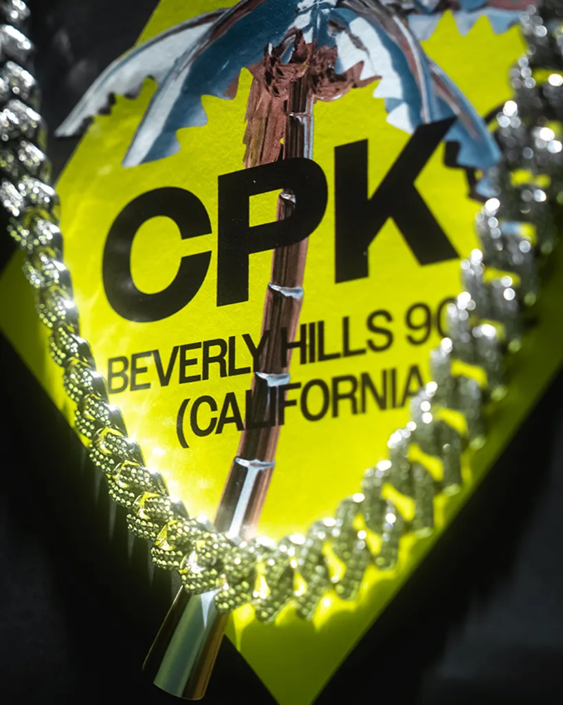
Beverly Hills’ hottest club is California Pizza Kitchen.
At least, that’s what someone unfamiliar with the brand might have taken away from its new “rebrand,” which debuted on Monday. On its website, California Pizza Kitchen replaced its friendly yellow logo and wordmark with a silver chrome logo and the shortened name “CPK.”
Meanwhile, on socials, the brand posted several videos of its “new identity” that looked more fit for promoting a rave than a family friendly pizza restaurant. Shots of flashing lights, serious models, and slogans like “DEVOUR THE DOUBTERS” and “Fresh. To. Death” were cut with clips of harshly-lit pizzas and interspersed with the brand’s new all-caps wordmark.
At first glance, one might have assumed these were assets for a new Liquid Death campaign or MSCHF launch. Many commenters on CPK’s socials were quick to question what was going on with the brand, including the official Little Caeser’s account, which commented, “Bestie what’s happening” on a particularly odd video. But, as it turns out, the whole edgelord rebrand was just a temporary marketing play to promote California Pizza Kitchen’s 40th anniversary. The restaurant just revealed the hoax through a partnership with actress Busy Phillips and restored its platforms to its original branding.
The campaign shows that, amidst an influx of purposefully shocking brand moves like Jaguar’s totally unrecognizable rebrand or Duolingo’s decision to briefly kill off its mascot, we’ve reached a new stage of the trend cycle: full brand-on-brand parody.
CPK’s midlife crisis
Dawn Keller joined California Pizza Kitchen’s as its CMO about a year ago. Since then, she says, she’s learned that sentiment around the brand is overwhelmingly positive, given that many customers associate it with years of childhood dinners. The issue, though, is that many fans “just don’t think about CPK that often,” Keller says.
Part of the problem is that the restaurant hasn’t made much of an investment in its marketing efforts to keep CPK top of mind. On socials, it has a staid strategy of essentially reposting traditional ad materials—an approach that’s less than ideal in a social media landscape that rewards brands who embrace big personalities and brain rot content. So, CPK decided to use the four decade milestone as an opportunity to shake things up by staging a “midlife crisis.”

Leading up to the campaign, CPK conducted extensive brand research with its creative agency, Iris Worldwide, to decide how the company might grab consumers’ attention. That work led them to the conclusion that their existing brand positioning and visual identity was strong enough to exclude the possibility of an actual rebrand. Instead, Keller says, the 40-year anniversary campaign riffs on the tendency of other mature brands to “go into panic mode” and debut a rebrand that loses touch with their original purpose.
“We were never of the opinion that we had to upend the apple cart and totally rebrand,” Keller says. “It was really more about, ‘How do we rejuvenate this brand, amplify it, but do it in a fresher way than we’ve done?’ [. . .] There was a bit of parody that we were doing, knowing that some brands evolve, and it’s great, but some, you feel like they jump the shark.”

While CPK’s hypebeast look only lasted for a week, Keller says the intention of the move was to usher the brand into a more adventurous, “culturally relevant” marketing era on social media.
For CPK, the marketing stunt surfaces an interesting tension between embracing a decades-old existing brand identity and parodying shock-value rebrands, while, at the same time, essentially benefitting from the shock-value strategy itself. Today, even brands who don’t actively embody what Fast Company has termed “DGAF branding” might still have to play into it to succeed online.

So far, the campaign has resulted in a mixed bag of responses. Keller says her team was expecting some confusion and backlash, both of which have been proven out. What’s surprised them, though, is that many fans actually liked the new look.
“You’ve got literally people who were giving it a thumbs up and supported it,” Keller says. “Maybe that’s the minority, but even to see people with positive reactions to the fake brand really made us laugh. I think it goes back to that brand equity that CPK has, which is, people want CPK to win. They really do. They love it. A lot of people grew up with it. Even when we do something that is—come on—objectively preposterous, they’re still celebrating it.”


